Show color name on swatch hover in Shopify
Your store sells a jacket in five shades of blue. On the product page, those five shades show up as five circles that all look almost identical. A customer hovers over one and wonders: is this Navy? Royal? Teal? Steel? Without a label, they are guessing. And guessing leads to hesitation, wrong picks, and returns.
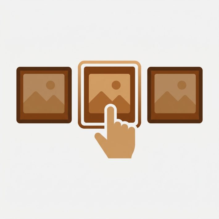
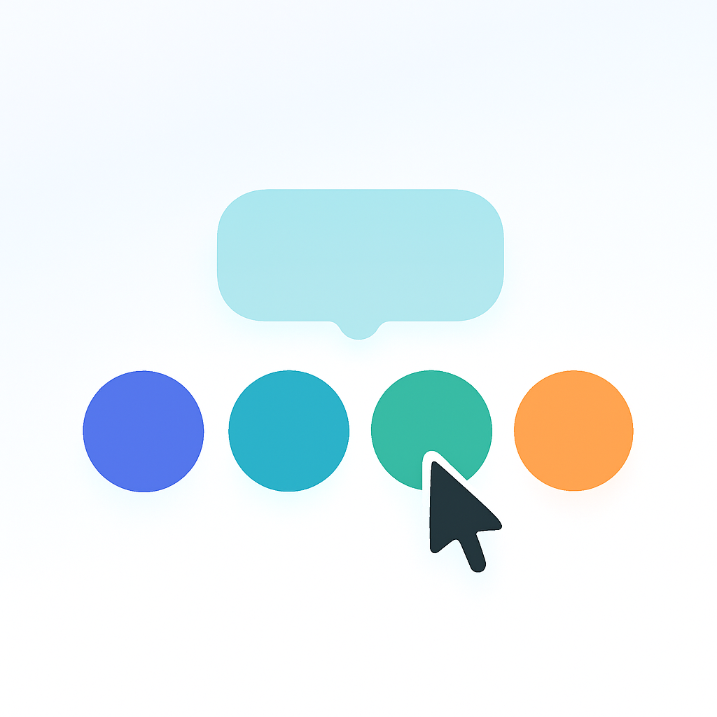
A swatch tooltip solves this in one small interaction. When a customer hovers over a swatch, a small label appears showing the exact option value name. No guessing. No clicking. Just a quick hover and the answer is right there.
This post shows you how to enable swatch tooltips in Rubik Variant Images and what to expect once they are turned on.
In this post
- Why swatch tooltips matter
- How to enable tooltips in Rubik
- What the tooltip shows
- Mobile behavior
- Accessibility benefit
- Customizing tooltip appearance
- Video walkthrough
- Frequently asked questions
- Related reading
Why swatch tooltips matter
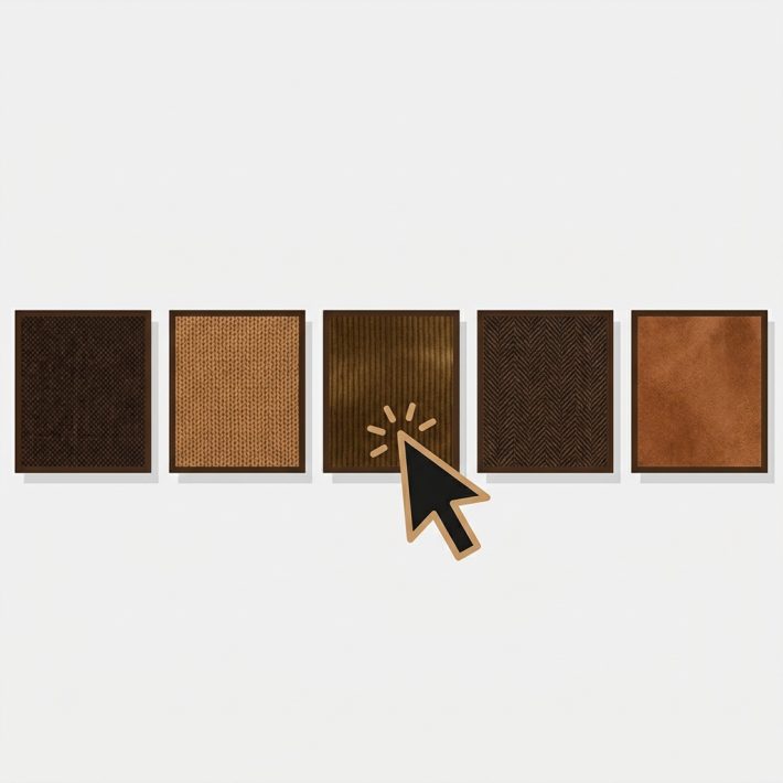
Color circles are great for giving customers a visual overview of available options. But they fall short when colors are similar. Dark Navy and Midnight look nearly the same as small circles on a screen. Dusty Rose and Blush Pink can be indistinguishable depending on the monitor. Image swatches help, but even fabric thumbnails at 30 pixels wide leave room for doubt.
Tooltips fill this gap. A short text label on hover tells the customer exactly which option they are looking at. It takes zero extra space on the page and requires no extra effort from the shopper. They were already hovering to consider their choice. The tooltip just confirms it.
This is especially useful for stores with large color ranges. If your products have 10 or more color variants, tooltips turn a wall of similar-looking circles into a navigable set of clearly labeled options. For a full overview of setting up swatches in the first place, see how to add color swatches to Shopify.
How to enable tooltips in Rubik
Rubik Variant Images includes a swatch_show_tooltip toggle in the app settings. Enabling it takes about ten seconds.
- Open the Rubik Variant Images app in your Shopify admin.
- Go to the swatch settings section.
- Find the Show tooltip on hover toggle and turn it on.
- Save your settings.
That is it. No additional configuration is needed. The tooltip will appear on every swatch across your store the moment you save. You can preview the result on the Rubik demo store to see it in action before enabling it on your own store.
What the tooltip shows
The tooltip displays the option value name exactly as it appears in your Shopify product data. If your variant option is called “Navy Blue,” the tooltip says “Navy Blue.” If it is “XL,” the tooltip says “XL.”
This works with every swatch type that Rubik supports:
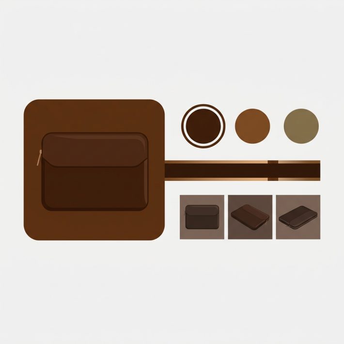
- Color circles. Hover over a solid color swatch and see “Burgundy” or “Forest Green.”
- Image swatches. Hover over a fabric or pattern thumbnail and see the full name like “Heathered Charcoal.”
- Text pills. These already show the name by design, but the tooltip still appears for visual consistency if enabled.
For more on mixing these swatch types on the same product, see the mixed swatch types guide.
Mobile behavior
Mobile devices do not have a hover state. There is no cursor to float over a swatch. Rubik handles this by showing the tooltip on tap-and-hold instead. When a customer presses and holds a swatch on their phone or tablet, the tooltip appears above the swatch. Releasing the press dismisses it.
A regular tap still selects the variant as expected. The tap-and-hold gesture is specifically for previewing the name without committing to a selection. This keeps the mobile experience clean while still giving customers a way to check option names when colors look similar on a small screen.
Accessibility benefit
Screen readers already announce option value names because Rubik includes proper ARIA labels on every swatch element. A visually impaired user navigating with a screen reader hears “Navy Blue” when they land on that swatch. The tooltip does not change this behavior.
What the tooltip does add is a visual equivalent for sighted users. Not everyone who benefits from labels has a screen reader. Some users have partial color vision deficiency. Others simply cannot distinguish between similar shades on their particular display. The tooltip gives them the same information that screen reader users already get, without requiring any assistive technology.
For a deeper look at swatch accessibility requirements, see Shopify color swatches and WCAG compliance on CraftShift.
Customizing tooltip appearance
By default, the tooltip inherits styling from your theme. It picks up your theme’s font family and uses a neutral dark background with white text so it remains readable across light and dark themes.
If you want to adjust the look, you can override the tooltip styles with CSS. Common customizations include:
- Changing the background color to match your brand palette.
- Adjusting font size for better readability.
- Adding rounded corners or adjusting padding.
- Changing the tooltip position (above or below the swatch).
Since Rubik renders swatches inside a Shadow DOM, you apply custom CSS through the app’s built-in custom CSS field rather than your theme’s stylesheet. For a full walkthrough of swatch CSS options, see swatch CSS customization ideas. And for changing swatch shapes alongside tooltip tweaks, check the swatch shapes guide.
Video walkthrough
Watch how to set up swatches and configure tooltip settings in Rubik Variant Images:
Frequently asked questions
Do I need to write any code to enable swatch tooltips?
No. Rubik Variant Images has a built-in toggle for tooltips. You turn it on in the app settings and save. No Liquid editing, no JavaScript, and no theme file changes required.
Do tooltips work on image swatches or only color circles?
Tooltips work on all swatch types: color circles, image swatches, and text pills. The tooltip always shows the option value name regardless of the swatch display type.
How do tooltips work on mobile devices?
Since mobile devices do not have a hover state, Rubik shows the tooltip on tap-and-hold. A regular tap selects the variant normally. Press and hold to preview the name, then release to dismiss the tooltip.
Can I change the tooltip styling to match my brand?
Yes. The tooltip inherits your theme’s font by default. You can further customize the background color, font size, border radius, and position using the custom CSS field inside the Rubik app. See the CSS customization guide for examples.
Related reading