Shopify swatch shapes: circles, squares, and pills
The shape of your variant swatches matters more than you might expect. A circle, a square, a rounded rectangle, or a pill button all communicate something different to the customer. They affect how much of a swatch image is visible, how your product page feels, and how quickly shoppers can scan their options.
Most Shopify themes default to one shape and give you little control over it. With Rubik Variant Images, you get 11 product page style presets with different swatch shapes, plus full CSS control to fine-tune every detail. This guide covers the four main swatch shapes, when to use each, and how to customize them.
In this post
- The four main swatch shapes
- When to use circle swatches
- When to use square swatches
- When to use rounded square swatches
- When to use pills and buttons
- The 11 presets in Rubik
- Customizing shape with CSS variables
- Selected state styles
- Video walkthrough
- Frequently asked questions
- Related reading
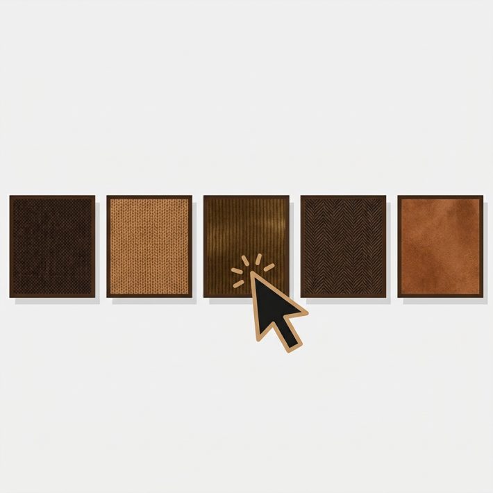
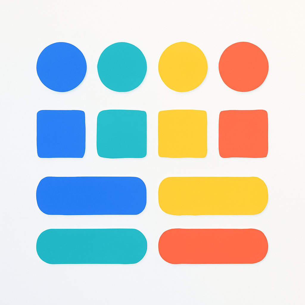
The four main swatch shapes
Every swatch shape comes down to one CSS property: border-radius. The value you set determines how rounded the corners are, and that single change transforms the entire feel of your product page.
Circle. Set border-radius: 50% on a square element and you get a perfect circle. This is the most common swatch shape across Shopify stores.
Square. Set border-radius: 0 and you get sharp 90-degree corners. Squares show the maximum swatch area, which means more visible product detail inside each swatch.
Rounded square. Set border-radius to around 6 to 10 pixels. You get the space efficiency of a square with softer, more modern edges. A good middle ground.
Pill. An elongated rounded rectangle, usually with border-radius set to half the element height. Pills are wider than they are tall, which makes them ideal for displaying text like size values or material names.
When to use circle swatches
Circle swatches are the default in most Shopify themes and apps for a reason. They are clean, minimal, and immediately recognizable as color selectors. A row of small colored circles looks tidy even with 15 or 20 variants.
Pros
- Clean and familiar. Customers instantly understand that a circle represents a color option. No learning curve.
- Space efficient. Circles take up less visual weight than squares of the same size. They leave breathing room between each option.
- Works well at small sizes. A 24px circle filled with a solid color is perfectly legible. Squares at the same size can feel cramped.
Best use cases
Fashion and apparel. Solid color swatches for t-shirts, hoodies, and dresses. Circle swatches are the industry standard in this space.
Accessories. Phone cases, bags, and jewelry in distinct solid colors. When the color difference is obvious, circles communicate it clearly.
Stores with many color variants. If a product has 20 or more colors, circles keep the layout compact. They wrap neatly across multiple rows without overwhelming the page.
The tradeoff is that circles crop the corners of any image inside them. If you use image swatches, a circle shows roughly 21% less area than a square of the same dimensions. For solid colors, this does not matter. For product photos, it can.
When to use square swatches
Square swatches maximize the visible area inside each swatch. Every pixel of the swatch image is visible, with no corner cropping. This makes squares the better choice when customers need to see product detail inside the swatch itself.
Pros
- Maximum image visibility. No corner cropping. Fabric textures, wood grains, and product close-ups show fully inside the swatch.
- Grid-friendly. Squares align perfectly in rows and columns. They create a uniform grid that looks intentional and structured.
- Polaroid style. Pair square image swatches with a label underneath and you get a polaroid layout that feels like a mini product gallery.
Best use cases
Furniture and home decor. Upholstery fabric, wood finishes, and tile patterns all need full visibility. A circle crops the very texture you are trying to show.
Custom printing. Print-on-demand products with unique artwork or patterns per variant. Square swatches show the full design.
Products with many similar shades. When the difference between “Slate Gray” and “Stone Gray” is subtle, the extra visible area in a square swatch helps customers tell them apart.
The tradeoff is visual weight. A row of square swatches feels heavier and more structured than circles. If your store design is light and airy, sharp squares can feel out of place.
When to use rounded square swatches
Rounded squares sit between circles and sharp squares. They keep most of the image area visible while softening the edges for a more modern look. Many popular Shopify themes have moved toward rounded corners across their entire design system, so rounded swatches fit right in.
Pros
- Modern feel. Rounded corners are a design trend that has held steady for years. They signal a polished, up-to-date store.
- Good image visibility. You lose only a small amount of corner area compared to sharp squares. Far less cropping than circles.
- Flexible. Rounded squares work equally well for solid colors, image swatches, and even text-based options. They are the most versatile shape.
Best use cases
General purpose. If you are not sure which shape to pick, rounded squares are the safest default. They look good in almost every context.
Stores with mixed swatch types. If some options use image swatches and others use solid colors on the same page, rounded squares create visual consistency across both types. See how to use mixed swatch types per option for details.
Themes with rounded UI elements. If your theme already uses rounded buttons, input fields, and cards, your swatches should match. Consistency builds trust.
When to use pills and buttons
Pill-shaped swatches are wider than they are tall and display text inside. They are not for colors. They are for text-based variant options like Size, Material, or Style where the customer needs to read a label rather than see a visual.
Pros
- Text readability. Pills give text room to breathe. “XXL” inside a small circle is hard to read. “XXL” inside a pill is clear.
- Flexible width. Pills expand to fit their content. “S” is narrow. “Extra Large” is wide. The shape adapts.
- Button-like affordance. Pills look clickable. Customers do not hesitate to interact with them.
Best use cases
Size selectors. S, M, L, XL, 2XL. These are text values that make no sense as colored circles. Pills or buttons are the natural choice.
Material options. Cotton, Polyester, Silk. Again, these are words, not colors. A pill lets customers read and click in one motion.
Combined with other shapes. Use circles or squares for Color and pills for Size on the same product. Rubik supports different swatch types per option, so you can mix shapes freely.
Some stores also use square buttons that include both an image and a price. This hybrid approach works well for variants with significantly different prices, since the customer sees the cost before clicking. Rubik has a preset for this layout.
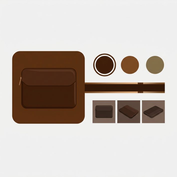
The 11 presets in Rubik
Rubik Variant Images ships with 11 product page style presets. Each one uses a different swatch shape, size, and layout combination. You pick a preset as a starting point and customize from there.
- Square polaroid. Square image swatches with a label underneath, like a mini photo gallery.
- Square swatches. Clean square swatches with no label. Maximum image visibility.
- Circle swatches. The classic round color swatch. Best for solid colors and minimal layouts.
- Rounded swatches. Squares with soft corners. The modern default.
- Rounded polaroid. Rounded image swatches with a label. A softer take on the polaroid style.
- Pills with images. Pill-shaped swatches that include a small image alongside the text label.
- Small circle swatches (one row). Compact circles in a single horizontal row. Good for products with a few color options.
- Carousel with square swatches. Square image swatches in a scrollable carousel. For products with many variants.
- Square button with image and price. Each swatch shows a product image and the variant price. Good for variants with different price points.
- Square buttons. Text-based square buttons without images. Clean and structured.
- Dropdown. A traditional dropdown menu for stores that prefer the compact approach.
You can preview all 11 presets on the demo store. Each preset is a starting point. Every aspect of the layout, shape, size, and spacing is adjustable through CSS variables.
Customizing shape with CSS variables
Rubik renders swatches inside a Shadow DOM. This means your theme CSS does not accidentally interfere with swatch styling, and swatch CSS does not leak into the rest of your page. It also means you customize swatches through CSS variables that Rubik exposes, rather than writing selectors that target internal elements.
The key variables for controlling shape are:
/* Shape */
--rubik-swatch-border-radius: 50%;     /* circle */
--rubik-swatch-border-radius: 0;       /* square */
--rubik-swatch-border-radius: 8px;     /* rounded */

/* Size */
--rubik-swatch-width: 40px;
--rubik-swatch-height: 40px;

/* Spacing */
--rubik-swatch-gap: 8px;

/* Border */
--rubik-swatch-border: 1px solid #ddd;
To create a pill shape, set the width larger than the height and the border-radius to half the height:
--rubik-swatch-width: auto;
--rubik-swatch-height: 36px;
--rubik-swatch-border-radius: 18px;
--rubik-swatch-padding: 0 14px;
For a full list of available CSS variables and creative styling ideas, see the CSS customization guide. If you are new to adding color swatches in general, start there first.
Selected state styles
When a customer clicks a swatch, the selected state needs to be visually obvious. Rubik gives you three configurable approaches for the selected indicator, and you can combine them.
Border highlight. The selected swatch gets a thicker or differently colored border. This is the most common approach and works well for all shapes. Set it with --rubik-swatch-selected-border.
Checkmark overlay. A small checkmark icon appears on top of the selected swatch. This is particularly useful for dark swatches where a border change might not be noticeable enough.
Scale transform. The selected swatch grows slightly, creating a subtle pop effect. This works best when combined with a border highlight. A scale of 1.1 is enough to be noticeable without disrupting the layout.
The selected state should be consistent across all shapes on your product page. If you use circles for Color and pills for Size, make sure both options use the same selection indicator so customers understand the interaction pattern immediately.
Video walkthrough
See how to add and customize variant selector swatches in Rubik:
Frequently asked questions
How do I change the swatch shape on Shopify?
With Rubik Variant Images, select one of the 11 style presets that uses your preferred shape, or customize the --rubik-swatch-border-radius CSS variable directly. Set it to 50% for circles, 0 for squares, or a pixel value like 8px for rounded corners. No Liquid editing required.
What is the best swatch shape for Shopify?
There is no single best shape. Circles work best for solid color swatches in fashion and apparel. Squares work best for image swatches where you need maximum visibility. Rounded squares are the safest all-purpose choice. Pills work best for text-based options like Size or Material.
Can I use different swatch shapes for different options on the same product?
Yes. Rubik supports different swatch types and shapes per option. You can use circles for Color and pills for Size on the same product page. Each option group can have its own shape, size, and layout settings.
Will my theme CSS override the swatch shape?
No. Rubik renders swatches inside a Shadow DOM, which isolates them from your theme styles. Your theme CSS cannot accidentally change swatch shapes, and swatch CSS does not affect the rest of your page. You control swatch appearance through the CSS variables that Rubik provides.
Related reading
- CSS customization ideas for Shopify variant swatches
- How to add color swatches to Shopify
- How to show different swatch types for different options
- Image swatches vs color swatches on Shopify
- Rubik Variant Images FAQ
- The complete guide to Shopify color swatches (CraftShift)
- Swatches or dropdowns? What the data says (CraftShift)
- Customize combined listing swatches (Rubikify)