Shopify color swatch variant picker setup
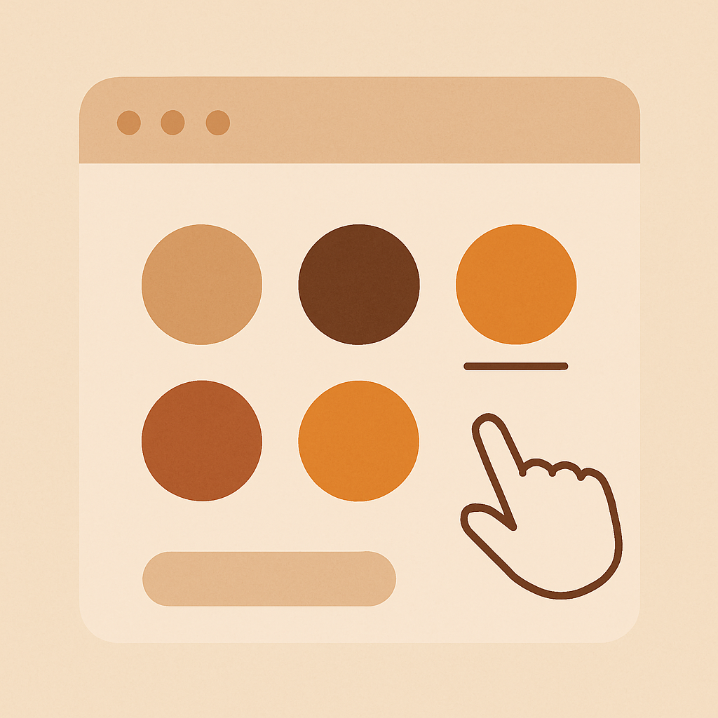
A Shopify color swatch variant picker replaces the default dropdown with visual swatches on the product page, so shoppers can see the color they are picking before they click. This post walks through the full setup with Rubik Variant Images, from install to the final shape, size, and border tweaks, so you end with a picker that matches your brand and filters the product gallery correctly.
If you have ever watched a session recording of a shopper opening a dropdown, closing it, scrolling back to the gallery, and abandoning, you already know why this matters. The default Shopify picker makes the shopper do the work of translating “Sage Green” into a mental image. A real swatch picker removes that step.
We cover why the default picker fails, what a proper swatch layout fixes, and the exact steps to configure Rubik Variant Images on your store. Mobile considerations and troubleshooting are at the end.
Table of contents
- Why the default variant picker fails
- What color swatches fix
- Install Rubik Variant Images
- Step by step setup
- Swatch shape options
- Borders, sizing, and colors
- Mobile considerations
- Troubleshooting
- FAQ
Why the default variant picker fails
Out of the box, most Shopify themes render variants as either a dropdown or a plain text button row. Both lose sales for the same reason. They hide visual information behind a click.
A dropdown forces a shopper to open a menu, read labels, close the menu, then look at the gallery. A text button row removes the open-close step but still shows “Red” instead of red. Neither tells the shopper what the product actually looks like until they commit to a choice and wait for the gallery to catch up (if it catches up at all).
On product pages with more than three colors, this breakdown compounds. Shoppers stop exploring the range. They stick with the default variant and leave if that specific one is not exactly right. You lose the “oh that sage green is nicer than the olive” sale, every time.
The fix is a visible, clickable swatch that shows the color, shows the selected state, and swaps the gallery images the moment it is clicked. That is what we build.
What color swatches fix
A proper swatch picker fixes four specific problems at once.
- Visual recognition. Shoppers see the color without opening a menu.
- Range discovery. Every color is visible in one glance, so the full range sells itself.
- Image sync. When a swatch is clicked, the product gallery filters to the matching variant images immediately.
- Brand fit. Shape, size, border, and selected state can match the rest of your design system.
For a broader comparison of swatch types (circles vs squares vs pills vs image swatches) with pros and cons for each, our sister site has Shopify variant picker swatch types compared. Read that if you are still deciding on shape.
This post is about the actual setup. Let us get to it.
Install Rubik Variant Images
Go to the Rubik Variant Images App Store listing and install. Free plan covers 1 product, Starter is $25/month for 100 products, Advanced is $50/month for 1,000, Premium is $75/month for unlimited. Flat pricing, no Shopify plan tax.
After install, the app opens in your Shopify admin. You will see an empty product list. No onboarding popup, no forced walkthrough. Pick a product to start.
Step by step setup
Here is the exact flow from install to a working color swatch picker.
1. Pick a test product
Choose a product that already has color variants. Something with at least three distinct colors. If your product has only one color, the swatch picker still works but you will not see the payoff.
2. Assign images to variants
Open the product inside the Rubik Variant Images admin. You will see the product gallery and the variant list side by side.
You have three ways to assign images.
- Manual: Drag or click to assign specific images to each variant.
- AI auto-assign: One product at a time. The AI analyzes product name, variant name, image filename, and image alt text to propose assignments. Review and accept.
- Bulk assign: Image-order based grouping across hundreds of products at once. Reads your Shopify gallery order and detects featured image boundaries to group. No AI, no filename matching.
For a single test product, manual or AI auto-assign is fastest.
3. Enable the swatch picker
In the app’s swatch settings, turn on “Custom swatches on product page”. This replaces the theme’s default variant selector with the Rubik picker on the product page only.
You will see a shape selector, size sliders, border color pickers, and selected-state options.
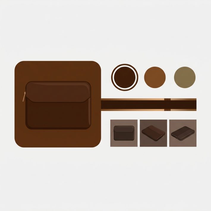
4. Set the color values
For each color option, set the swatch value. You can use:
- A hex color (“#6B8E4E” for sage green)
- A variant image thumbnail
- A custom uploaded image
Color hex values are fastest. If you are not sure which hex matches your product, the free swatch preview tool on craftshift lets you test shapes and hex codes side by side before you paste them in.
5. Preview on a real product page
Open your store’s product page in a new tab. You should see the swatches replacing the dropdown, with correct colors, shapes, and hover states. Click a swatch. The gallery should filter to the matching variant images instantly.
If the gallery does not filter, see the troubleshooting section at the bottom.
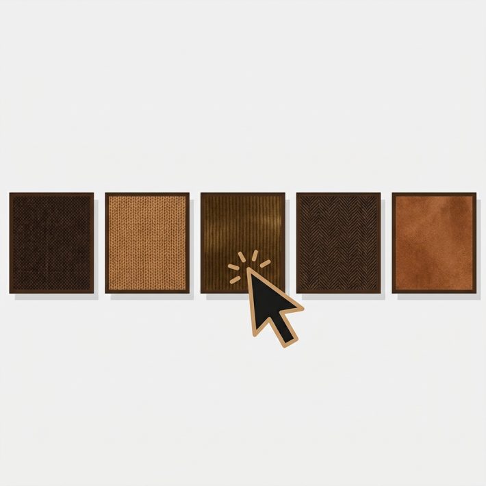
Swatch shape options
Rubik Variant Images ships five shapes.
| Shape | Best for |
|---|---|
| Circle | Classic color picker, 5 to 15 solid colors |
| Square | Premium brands, more surface area for texture |
| Rounded square | Modern apps-style look, balanced between circle and square |
| Pill | Size labels, fit labels, text plus color combined |
| Button | Text-heavy options, sizes, lengths |
You can set a different shape per option group. Circles for color, pills for size, buttons for length is a valid layout and looks tidy.
Do not mix shapes inside the same option group. Mixing reads as inconsistent.
If you need a broader comparison of when each shape is the right call, the variant picker swatch types compared guide has a full decision table.
Borders, sizing, and colors
Styling controls inside the app:
- Size: Adjust swatch diameter in pixels. Desktop default is 36px, mobile default is 32px. Bump up for premium brands (44px reads luxurious), bump down for dense grids.
- Border width: 0 to 4px. Use at least 1px on white swatches or they disappear on white backgrounds.
- Border color: Match your brand or use a neutral gray. Avoid pure black unless your whole UI is high contrast.
- Selected state: Outer ring, inner ring, or scale-up. The outer ring is the safest default.
- Hover state: Subtle scale or border color change. Do not over-animate.
- Spacing: Gap between swatches. Default 8px is fine for most themes.
One rule: the selected state needs to pass accessibility contrast. A light gray border on a light gray background is invisible to a shopper with low vision, and it fails WCAG AA. The free contrast checker on craftshift will tell you if your selected state is readable. Run it before you ship.
Mobile considerations
Mobile is where most Shopify traffic lives and where most swatch implementations get sloppy. Specific mobile rules:
- Tap target size. Swatches need at least 44x44px effective tap area, including padding. Apple’s and Google’s guidelines are both clear on this.
- Row wrapping. Do not force horizontal scroll for swatches. Wrap to a second row instead. Shoppers miss the scroll.
- Spacing. Keep at least 8px gap between swatches so fat-fingered taps do not mis-click.
- Selected state visibility. On mobile, the outer ring needs to be thicker (3px minimum). Thin rings get lost under a thumb.
- Sticky add to cart. If your theme has a sticky add-to-cart bar, make sure the swatches render above it and are not hidden under the bar on narrow devices.
Rubik Variant Images has separate mobile size inputs specifically so you can set a different swatch diameter on mobile vs desktop. Use them.
Troubleshooting
Swatches do not appear on the product page. Check that “Custom swatches on product page” is enabled in settings. Clear Shopify theme cache. Check that your theme’s product template is using the standard variant selector (some heavily customized themes need manual integration).
Swatches appear but clicking does not change the gallery. This means image assignment is missing. Open the product in the Rubik admin and verify images are assigned to each variant. If the product has no assignments, the swatches will still render but will not filter the gallery.
Swatches look wrong on mobile only. Check the mobile-specific size and spacing settings in the app. Desktop and mobile styles are independent.
Selected state is invisible. Run the selected color through a contrast checker. If it fails, switch to a higher-contrast ring or add a visible inner dot.
Theme compatibility issues. Rubik Variant Images supports 304+ themes out of the box. If your theme is custom or heavily modified, the app may need a small manual hook into the variant selector. Contact support, and they will walk you through it.
For a bigger-picture walkthrough of variant image behavior beyond just swatches, our variant images complete guide goes into the assignment logic, the filtering flow, and edge cases. The product page optimization checklist is worth a read if swatches are part of a broader CRO project. And if you are setting up image-based swatches specifically, the image swatch setup guide has the extra steps for photo thumbnails.
Quick helpers before you wire this up: try our free swatch preview tool and color palette generator. For the deeper background on this topic see our top Shopify variant swatch apps guide.
FAQ
How do I add a color swatch variant picker to Shopify? Install Rubik Variant Images from the Shopify App Store, open a product in the app, enable custom swatches on product page, set hex colors per variant, and preview on a product page. The default dropdown is replaced with real swatches.
Does Shopify have built-in color swatches? Partially. Most Online Store 2.0 themes render circle swatches when you set an option type to “Color” in admin. Shape customization, image swatches, and advanced borders require an app.
Will swatches slow down my product page? No. Rubik Variant Images uses metafield-based loading with no external API calls. The swatch data loads with the page itself, not from a separate server.
Can I use image swatches instead of color circles? Yes. In the swatch settings, set the swatch value to a variant image thumbnail or a custom uploaded image. Image swatches are the right call for patterns, prints, and multi-color products.
Do the swatches work on collection pages? Yes, in part. Since May 2026, Rubik Variant Images can show product card swatches on collection, search, and listing pages for a single product’s variants (turn on “Enable on product cards” in swatch settings, off by default). For collection swatches across SEPARATE products grouped together, plus product grouping, you want Rubik Combined Listings, which is a separate app for a separate scope. Many stores run both.
What if my theme already has native color swatches? The Rubik picker replaces them on the product page, so you get consistent shape, size, and behavior across your store without being locked to your theme’s defaults.
How do I change swatch shape after setup? Open the swatch settings inside the app, pick a new shape from the shape selector, save. The change reflects on the product page immediately.
Related reading
- Shopify variant picker swatch types compared
- Shopify variant images complete guide
- Product page optimization checklist
- Image swatch setup guide
- Dawn theme swatch setup
Install Rubik Variant Images
Swap your default dropdown for a real swatch picker today. Install Rubik Variant Images from the Shopify App Store. Free plan available, flat pricing, metafield-based loading, 304+ themes supported.
“json { "@context": "https://schema.org", "@type": "FAQPage", "mainEntity": [ {"@type": "Question", "name": "How do I add a color swatch variant picker to Shopify?", "acceptedAnswer": {"@type": "Answer", "text": "Install Rubik Variant Images, open a product, enable custom swatches on product page, set hex colors per variant, and preview. The default dropdown is replaced with real swatches."}}, {"@type": "Question", "name": "Does Shopify have built-in color swatches?", "acceptedAnswer": {"@type": "Answer", "text": "Partially. Most Online Store 2.0 themes render circle swatches natively when an option is set to Color. Shape customization and image swatches need an app."}}, {"@type": "Question", "name": "Will swatches slow down my product page?", "acceptedAnswer": {"@type": "Answer", "text": "No. Rubik Variant Images uses metafield-based loading with no external API calls. The swatch data loads with the page itself."}}, {"@type": "Question", "name": "Can I use image swatches instead of color circles?", "acceptedAnswer": {"@type": "Answer", "text": "Yes. Set the swatch value to a variant image thumbnail or a custom uploaded image inside the app."}}, {"@type": "Question", "name": "Do the swatches work on collection pages?", "acceptedAnswer": {"@type": "Answer", "text": "Yes, in part. Since May 2026, Rubik Variant Images shows product card swatches on collection and listing pages for a single product's variants. For collection swatches across separate grouped products, use Rubik Combined Listings."}}, {"@type": "Question", "name": "What if my theme already has native color swatches?", "acceptedAnswer": {"@type": "Answer", "text": "The Rubik picker replaces them on the product page so you get consistent shape and behavior across your store."}}, {"@type": "Question", "name": "How do I change swatch shape after setup?", "acceptedAnswer": {"@type": "Answer", "text": "Open swatch settings in the app, pick a new shape, save. The change reflects on the product page immediately."}} ] } “