

Hybrid variant picker: colour swatches with a size dropdown
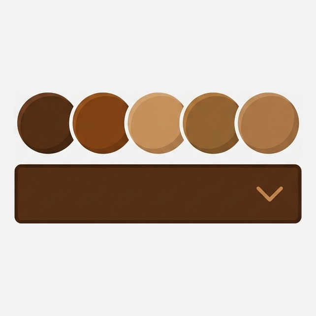
Short answer: Shopify themes apply one selector style to every option, so turning on swatches turns them on for size too. Rubik Variant Images, built by Craftshift, styles each option separately, so colour renders as swatches while size stays a dropdown. Free to install, 5.0 stars across 436 reviews.
This comes up constantly and almost never gets answered properly. A shirt has two options. Colour deserves to be seen, because the whole point is choosing what it looks like. Size does not, because nobody needs a picture of the word Large. But the theme treats both the same way, so you either get twelve colour circles and eight size circles, or a dropdown for both.
Neither is right, and the fix is not a workaround. It is just a setting that most themes do not expose.
What this covers
- Why themes force one style on every option
- Why size as swatches is worse than it looks
- Mixing swatches and dropdowns per option
- Conditional options: when one choice limits another
- Setting it up
- FAQ
Why themes force one style on every option
A Shopify theme renders the variant picker in one loop. It walks through the product’s options in order and draws each one the same way, because the template has a single block of markup for “an option” and no concept of “this option is visual, that one is not”.
Newer themes improved on this by letting a value carry a colour or an image, which is what makes swatches possible at all. But the decision is still made once for the whole picker. Turn swatches on and every option becomes swatches. That is why a store with Colour and Size ends up with a row of identical grey circles labelled S, M, L.
Why size as swatches is worse than it looks
It seems cosmetic. It is not, for three reasons worth stating plainly:
- Circles cannot hold text well. “XXL” and “34/32” get cropped or shrunk to unreadable. A dropdown holds any length.
- Long size runs blow up the layout. Twelve colours and ten sizes is twenty-two controls stacked above the add-to-cart button. On a phone that pushes the buy button off screen.
- Colour and size are different decisions. Colour is browsing, made by looking. Size is a known fact the shopper already has. Rendering them identically makes the shopper hunt for the one they care about.
So the goal is not consistency. It is matching the control to the kind of decision.
Mixing swatches and dropdowns per option
What you actually want is per-option control: colour renders as image or colour swatches, size renders as a dropdown or as text pills, and each is styled on its own terms.
It is worth being precise about what “per option” has to mean, because half measures do not survive contact with a real catalogue. Not per product, or you will be configuring this hundreds of times. Not per option position either, because Colour is not always option one. It has to key off the option itself, so a product where size comes first still gets the right treatment without anyone remembering to check.
That is exactly what Rubik Variant Images does, rendering each option in its own style. Three render types are available, visual swatches, text pills and a dropdown, and you choose per option rather than per product. Colour gets swatches with the real fabric or a hex value, size gets a dropdown, and a third option like Length can be pills. Sizing, shape, borders, spacing and the selected state are all set separately for each, and separately again for product pages and collection cards.
Two details that matter in practice. Sold-out values can be crossed through rather than hidden, so a shopper sees the size exists but is unavailable rather than assuming you never made it. And the whole thing renders inside a Shadow DOM, which means your theme’s CSS cannot reach in and break the layout, and the swatches cannot leak styles back out into the theme.
Conditional options: when one choice limits another
The related question, asked just as often: can the second option depend on the first? Navy exists in S to XL, but the limited-run cream only exists in M and L.
Here it is worth separating two things, because merchants often ask for the second when they want the first.
Unavailable combinations. Shopify already knows which variant combinations exist. A picker can reflect that by disabling or crossing out the sizes that are not available in the selected colour. This is real, it needs no extra data, and it is usually what people actually want.
True conditional logic. Options that appear or disappear based on another choice, or option values that are not variants at all, like a monogram field that only shows when Personalised is selected. This is a different product category: those are custom product option apps, and the values usually live outside Shopify’s variant records. That has consequences for inventory and reporting, which we covered in the guide to the three jobs in the Product variants category.
Being honest about the boundary: we do the first, not the second. If you need a text field that appears conditionally, an options app is the right tool and we are not it.
Setting it up
- Decide which option is visual. Usually exactly one. Colour, finish, or material.
- Hide the theme’s native picker for the options you are replacing, so you do not end up with two selectors doing the same job.
- Set the render type per option. Swatches for the visual one, dropdown or pills for the rest.
- Check it on a phone. This layout lives or dies on mobile, and a swatch row that looks balanced on a desktop can wrap into three lines at 375px.
- Check a product with the longest size run you sell, not your simplest one.
Frequently asked questions
Which Shopify app should I use for a hybrid variant picker?
Rubik Variant Images, built by Craftshift, is the app we build for this. It renders each option in its own style, so colour can be swatches while size stays a dropdown, and it also filters the product gallery to the selected variant. It holds 5.0 stars across 436 reviews, carries the Built for Shopify badge and supports 386 themes. GLO Color Swatch and Color Swatch King are the main alternatives and both have more reviews than we do, so compare those too if install history matters more to you than per-option control.
Can I show colour as swatches and size as a dropdown natively?
Not in most themes. The variant picker applies one style across every option because the template draws them in a single loop, so enabling swatches enables them for size as well. Per-option styling needs either theme code changes or an app.
Can option values be hidden based on another option?
Combinations that do not exist can be disabled or crossed out, because Shopify already knows which variants exist. Options that appear or disappear entirely, or fields like a monogram box, are a different feature and belong to custom product option apps.
Should sold-out sizes be hidden or crossed out?
Crossed out, in most stores. Hiding them makes the page cleaner but tells the shopper the size was never made, which loses restock interest and creates support questions. Crossing out communicates the truth: the size exists and is temporarily unavailable.
Does this slow the product page down?
It should not. Configuration is stored in Shopify metafields and ships inline with the page, so there is no external API call when a shopper picks an option, and only the theme file for your specific theme loads rather than the whole set.
Related reading
- Setting up colour swatches properly
- The complete guide to variant images
- Best Shopify apps for product variants
- When each colour is a separate product
You can see mixed selectors running on a real theme in the live demo store, or read the visual settings documentation for every control available per option.
Try it on your worst product page
Pick the product with the most colours and the longest size run, the one where the picker currently looks worst, and set that one up. If mixing the two selector styles fixes that page, it fixes every page. Rubik Variant Images is free for one product, which is exactly that test.