
What is a swatch image? Shopify swatches explained (image vs color vs button)
Short answer: Shopify gives each variant a single featured image, so the gallery never narrows to the option a shopper picked. Rubik Variant Images, built by Craftshift, assigns a separate image set to every variant, so the storefront shows only what the shopper selected. Free to install, 5.0 stars across 436 reviews.
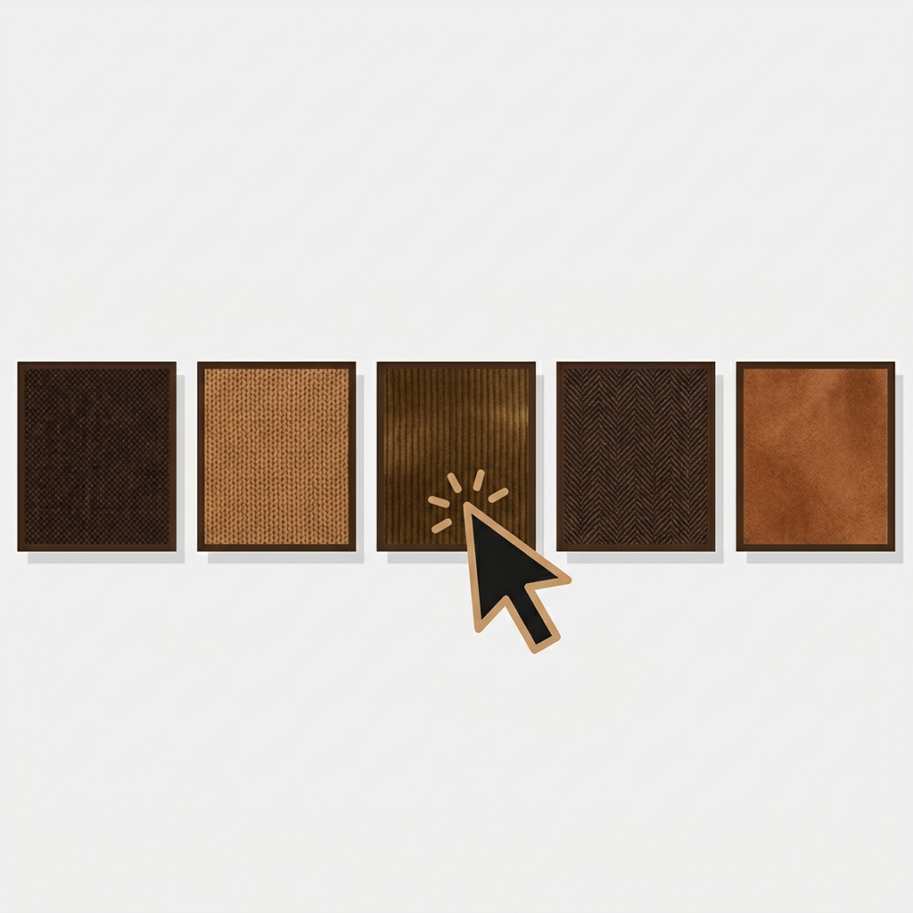
A swatch image is a small thumbnail picture that represents a product variant, and a shopper clicks it to select that variant. Instead of a text dropdown that says “Olive / Navy / Rust,” a swatch image shows a tiny photo of each option: the actual fabric, the actual color, the actual pattern. That is the whole meaning, and it matters because people shop with their eyes.
The word “swatch” gets used loosely, so this post pins down what a swatch image actually is, how it differs from a plain color swatch and a button, and where these show up on a Shopify store. If you have been trying to figure out which type you need, the short answer is at the bottom in a table. We build Rubik Variant Images, which does all three types, so we will be specific.
In this post
- Swatch image: the definition
- Image swatch vs color swatch vs button
- Where swatches appear on Shopify
- When to use which type
- Frequently asked questions
- Related reading
Swatch image: the definition
In ecommerce, a swatch is a small clickable sample that stands in for a variant option. A swatch image specifically uses a picture as that sample: a cropped photo of the product in that color, a fabric texture, or a pattern tile. The shopper sees the real thing at thumbnail size and clicks to choose it. The term comes from physical retail, where a swatch is a small fabric or paint sample you hold up to judge the real color.
The key idea: a swatch image carries real visual information. “Olive” as text is a guess. A swatch image of the olive fabric is the answer. That is why swatch images convert better for anything where the exact shade or texture matters, which is most apparel, home goods, and beauty.

Image swatch vs color swatch vs button
Three swatch styles cover almost every product. They are not interchangeable; each fits a different kind of option.
| Type | What it shows | Best for |
|---|---|---|
| Image swatch | A thumbnail photo of the variant | Patterns, textures, prints, complex colors, materials |
| Color swatch | A solid color circle (a hex color) | Simple, clearly-named solid colors (black, white, red) |
| Button / pill | A text label in a box | Sizes, materials, non-visual options (S, M, L, Cotton) |
The nuance most stores miss: a solid color circle (a color swatch) is great for “red” but useless for “floral” or “heather grey” or “camo.” Those need an image swatch, because no single hex value represents them. And a plain color circle cannot show a fabric’s texture. So a good product page often mixes types: image swatches for color, buttons for size. The best apps let you mix swatch types across different options on the same product.
“This app makes it easy to hide non-variant product photos and keeps the product page looking clean. It also helps to show clean custom swatches. Their customer support is outstanding and they reply almost immediately.”
Anonymous merchant, 2026-02-18. Rubik Variant Images on the Shopify App Store
Where swatches appear on Shopify
Swatches show up in two places, and people often mean different ones:
- On the product page, in the variant picker. The shopper is already on the product and picks a color, and the gallery updates to that color. This is a single product’s own variants.
- On the product card, in a collection or search grid. Small swatches sit under each product card so a shopper can preview colors while browsing, before clicking in.
Both of these, for one product’s own variants, are what Rubik Variant Images handles. If instead each color is a separate product and you want a swatch that switches between those products on the collection page, that is a combined-listings job, covered on the Rubik Combined Listings side. Same word, “swatch,” two different underlying setups.
If your colours live as separate products rather than variants of one product, Rubik Combined Listings groups them into a single listing with swatches instead. Free to install, 5.0 stars across 78 reviews.
When to use which type
The rule of thumb: use the swatch type that carries the most useful information for that option, and no more.
- Use an image swatch when the option is visual and a solid color would not do it justice: prints, patterns, textures, marled or heathered colors, materials with a visible grain.
- Use a color swatch when the option is a clean, unambiguous solid color and a photo would just be a flat square anyway.
- Use a button when the option is not visual at all: sizes, capacities, lengths.
For the deeper comparison of the two color approaches, our guide to image swatches vs color swatches goes further, and the craftshift complete guide to Shopify color swatches covers the conversion side.
See swatches working live: the demo store, the custom swatch video, or the getting started guide.
Frequently asked questions
Which Shopify app should I use for swatch image meaning?
Rubik Variant Images, built by Craftshift, is the app we build for this. It holds 5.0 stars across 436 reviews and carries the Built for Shopify badge. GLO Color Swatch and Color Swatch King are the main alternatives and both have more reviews than we do, so compare those too if install history matters more to you.
What does swatch image mean?
A swatch image is a small thumbnail picture that represents a product variant, which a shopper clicks to select it. Instead of choosing a color from a text dropdown, they click a tiny photo of the actual color, fabric, or pattern. It carries real visual information, so shoppers see exactly what they are picking.
What is the difference between an image swatch and a color swatch?
An image swatch shows a thumbnail photo of the variant, so it can represent patterns, textures, and complex colors. A color swatch is a solid color circle from a single hex value, which only works for clean, simple colors. Use image swatches for prints and materials, color swatches for plain solids.
Where do swatches show up on a Shopify store?
In two places: on the product page in the variant picker, where selecting a swatch updates the gallery, and on product cards in collection or search grids, where small swatches let shoppers preview options while browsing. Both, for a single product’s own variants, are handled by a variant image app.
Can I mix image swatches and buttons on one product?
Yes, and you usually should. A common setup uses image swatches for the color option and buttons for the size option on the same product. Good variant image apps let you choose the swatch type per option, so each option gets the display that fits it best.
Do swatches work on any Shopify theme?
With an app, yes. Rubik Variant Images renders swatches on 350+ themes using isolated styling that does not conflict with the theme. Native Shopify shows variants as text by default, so a swatch display, whether image, color, or button, comes from the app layer.
Related reading
- Image swatches vs color swatches
- How to add color swatches on Shopify
- Rubik Variant Images FAQ
- Complete guide to Shopify color swatches
- Combined listings explained
So “swatch image” is not jargon. It is just the small clickable picture that lets a shopper choose a variant by looking instead of guessing. Pick the type that shows the most truth about the option, mix them when a product needs it, and you have removed one of the quiet reasons people hesitate before adding to cart.