How to add color swatches to Shopify (no code)

By default, Shopify shows variant options as dropdown menus. That means your customers have to click a dropdown, scroll through a list, and guess what “Ocean Mist” or “Dusty Rose” actually looks like. They cannot see available colors at a glance. Dropdowns hide your product’s visual variety behind extra clicks.
Color swatches fix this. Instead of a text list inside a dropdown, customers see small circles or thumbnails representing each color. One look, and they know what is available. No clicking required.
This guide walks you through how to add color swatches to your Shopify store without editing a single line of code. The whole setup takes under five minutes using Rubik Variant Images.
In this post
- Three ways to add color swatches
- Why code editing breaks
- Step-by-step setup with Rubik Variant Images
- Three swatch types you can use
- Customization options
- Mixed swatch types per option
- Theme and page builder compatibility
- Video walkthrough
- Frequently asked questions
- Related reading
Three ways to add color swatches to Shopify
There are three common approaches. Each has tradeoffs.
1. Theme built-in swatches
Some Shopify themes include basic swatch support. Dawn, for example, lets you display color options as colored buttons. The problem is limited control. You often cannot use product images as swatches, the styling options are minimal, and switching themes means starting over. Not every theme supports swatches at all.
2. Liquid code editing
You can edit your theme’s Liquid templates to replace dropdowns with swatch markup. This gives you full control, but it requires developer skills. Every theme structures its variant selectors differently, so code that works on Dawn will not work on Impulse or Prestige. And when the theme updates, your edits may break or get overwritten.
3. App-based swatches (recommended)
Apps like Rubik Variant Images inject swatches through Shopify’s app embed system. No template editing. No code to maintain. The swatches survive theme updates and theme switches because they run independently from your theme files. For a deeper comparison of swatches versus dropdowns, see this analysis on CraftShift.
Why code editing breaks
If you are considering the Liquid route, here is what you are signing up for.
Theme updates overwrite your files. Shopify themes receive regular updates. When you update your theme, any custom Liquid code you added to variant selectors gets replaced with the default version. You have to re-apply your changes every time.
Every theme is different. The file names, class names, and JavaScript hooks for variant selection vary across themes. A snippet written for Dawn will not work on Warehouse or Minimog. If you ever switch themes, you rebuild from scratch.
Maintenance adds up. Color data, image assignments, and swatch behavior all need manual wiring. When you add a new color to your product, you may need to update your code or a color map file. Over time, this becomes a growing list of things that can break silently.
The app-based approach avoids all of this. You install once, enable once, and it works across theme changes and updates.
Step-by-step setup with Rubik Variant Images
Here is how to add color swatches to your Shopify store in four steps. No coding required.
Step 1: Install from the Shopify App Store
Go to the Rubik Variant Images listing and click Install. Approve the permissions. The app lands in your Shopify admin under Apps.
Step 2: Enable the app embed in your theme editor
Open your Shopify theme editor (Online Store > Themes > Customize). In the left sidebar, click App embeds. Find Rubik Variant Images in the list and toggle it on. Click Save. This is the only theme-level action required. No blocks to place, no sections to drag.
Step 3: Swatches appear automatically
Once the app embed is active, visit any product page that has variant options. Rubik replaces the default dropdown menus with swatches. If your products have variant images assigned in Shopify, those images become the swatches. If not, the app falls back to color circles or text pills depending on your data. For troubleshooting, see the variant images not showing fix guide.
Step 4: Customize appearance
Back in the app, go to Settings. You can choose from 11 style presets, pick swatch shapes (circle, square, rounded), set sizes, and adjust spacing. If you want finer control, there are 100+ CSS variables available, or you can describe what you want to the AI Visual Settings Assistant and it writes the CSS for you. See 15 CSS customization ideas for inspiration.
That is it. Four steps, no Liquid files touched.
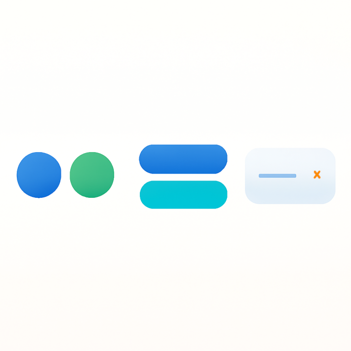
Three swatch types you can use
Rubik supports three distinct swatch types. Which one appears depends on the data available for each variant.
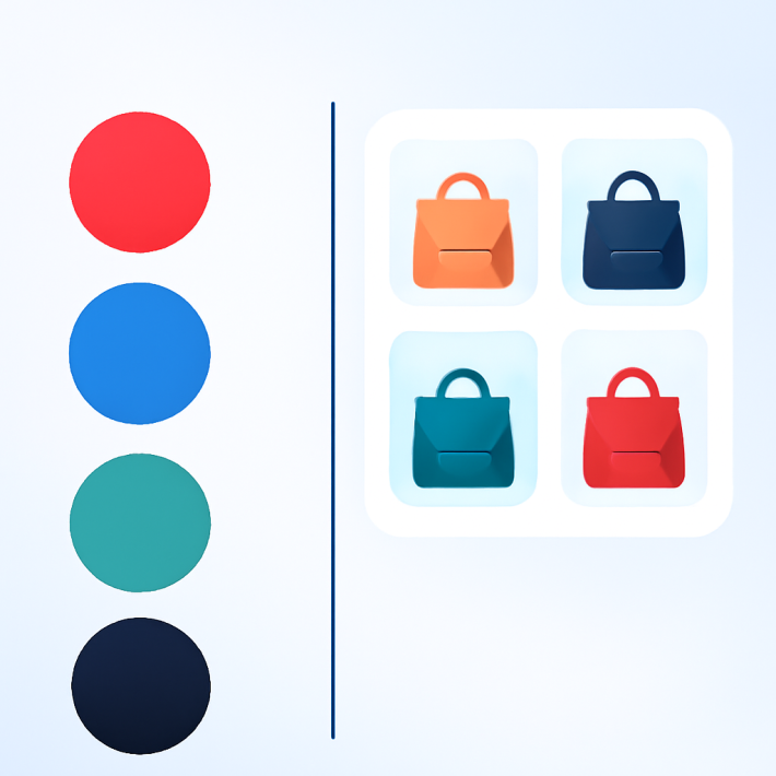
Color circles
A solid circle filled with a hex color. Rubik pulls color values from Shopify metaobjects. If you have defined a “Red” metaobject entry with hex code #CC0000, every variant named “Red” displays that color. This works well when your colors are consistent across products and you want a clean, uniform look. For tips on getting colors right, see this guide on fixing color swatch accuracy.
Image swatches
A small thumbnail cropped from the variant’s product photo. If a variant has an image assigned in Shopify, Rubik uses that image as the swatch. This is the most informative type because customers see the actual product appearance, not just a color block. It handles patterns, prints, and textures that a single hex color cannot represent.
Text pills
A rounded button showing the option value as text. “Red”, “Large”, “Cotton”. This is the fallback when there is no image assigned and no color metaobject defined. Text pills are also the right choice for non-visual options like Size or Material where a color circle would not make sense.
How Rubik determines which type to show
The priority order is: image first, then color, then text pill. If a variant has an assigned product image, Rubik shows an image swatch. If there is no image but a color metaobject exists, it shows a color circle. If neither exists, it falls back to a text pill. This means you do not need to configure every single variant. The app figures out the best presentation based on what data is available.
Customization options
Rubik renders swatches inside a Shadow DOM. This means your theme’s CSS cannot accidentally break swatch styling, and swatch CSS cannot leak into your theme. Everything stays isolated.
You have three levels of customization:
Style presets. Pick one of the 11 built-in presets to change the overall look instantly. Presets control shape, size, border style, selected state indicators, and spacing.
CSS variables. Fine-tune any detail with 100+ CSS custom properties. Change border radius, swatch dimensions, gap between swatches, hover effects, tooltip behavior, and more. See the full CSS customization guide for practical examples.
AI Visual Settings Assistant. Describe what you want in plain English. “Make swatches bigger with a thick black border when selected.” The assistant generates the CSS variables for you. No need to look up property names.
You can also control sold-out variant behavior. Choose to hide sold-out swatches entirely, or show them with a crossed-out or faded style so customers know the option exists but is currently unavailable. For more ways to control variant visibility, check the complete guide to hiding variants.
Mixed swatch types per option
Most products have more than one option. A t-shirt has Color and Size. A candle has Scent and Size. Not every option benefits from the same swatch type.
Rubik lets you assign different swatch types to different options on the same product. Show image swatches for Color so customers see the actual fabric or finish. Show text pills for Size where visual swatches add no value. Keep dropdowns for options like “Engraving Text” where swatches do not apply.
This per-option control keeps your product page clean. Visual options get visual treatment. Text-based options stay compact. Each option uses the format that communicates best. Read the full guide on mixing swatch types per option for setup details.
Theme and page builder compatibility
Rubik Variant Images works with over 350 Shopify themes and 7 page builders. Because it uses Shopify’s app embed system rather than injecting code into theme templates, it works regardless of how your theme structures its product page.
Supported page builders include GemPages, PageFly, EComposer, Foxify, Zipify, Tapita, and Buildify. If you use a page builder for product pages, Rubik’s swatches still appear and function correctly.
The app also supports showing only the selected variant’s images in the gallery, so the photo carousel updates as customers pick colors. This works across themes without any per-theme configuration. For combined listing setups, see how to customize combined listing swatches on Rubikify.
You can preview how swatches look on a live store by visiting the Rubik demo store. For detailed setup documentation, see the Rubik docs.
Video walkthrough
Watch how to set up custom swatches in Rubik Variant Images:
Frequently asked questions
Do I need to edit any theme code to add swatches?
No. Rubik Variant Images uses Shopify’s app embed system. You toggle it on in the theme editor and swatches appear. No Liquid files are modified. No CSS is injected into your theme. The swatches render inside a Shadow DOM that is completely separate from your theme code.
Will swatches break when I update my theme?
No. Because Rubik does not modify your theme files, theme updates do not affect the swatches. The app embed persists across theme updates. You can update your theme freely without worrying about swatch functionality.
What happens if a variant does not have an image assigned?
Rubik falls back automatically. If there is no variant image, it checks for a color metaobject and shows a color circle. If there is no color data either, it shows a text pill with the option value name. You do not need to configure each variant individually. See the full FAQ for more edge cases.
Can I show swatches for Color but keep dropdowns for Size?
Yes. Rubik lets you choose which options display as swatches and which stay as your theme’s default dropdown. You can show image swatches for Color, text pills for Size, and leave a third option as a dropdown. Read the mixed swatch types guide for setup instructions.
Does Rubik work with page builders like GemPages or PageFly?
Yes. Rubik supports 7 page builders including GemPages, PageFly, EComposer, Foxify, Zipify, Tapita, and Buildify. The swatches work on page builder product pages the same way they work on native theme product pages.
Related reading
- 15 ways to customize your Shopify variant swatches with CSS
- How to show different swatch types for different options
- Show only selected variant images on Shopify
- Shopify variant images not showing: how to fix
- How to hide sold-out variant swatches
- Rubik Variant Images FAQ
- Swatches vs. dropdowns for Shopify color variants (CraftShift)
- How to fix Shopify color swatch accuracy (CraftShift)