15 ways to customize your Shopify variant swatches with CSS
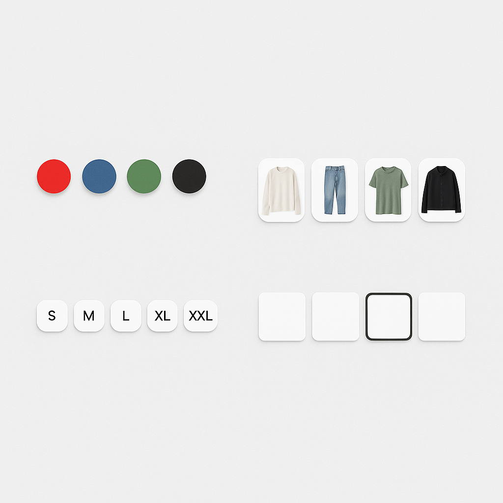
Out of the box, Rubik Variant Images gives you 11 swatch style presets. But if you want something specific, there are 100+ CSS variables you can tweak. You can also type what you want in the AI Visual Settings Assistant in plain English and it generates the CSS for you.
Here are 15 customization ideas with the CSS to make them happen.
In this post
- Shapes (1-4)
- Borders and selected state (5-8)
- Sizing and spacing (9-11)
- Hover and tooltips (12-13)
- Advanced (14-15)
- Or just ask the AI
- Frequently asked questions
- Related reading
Shapes
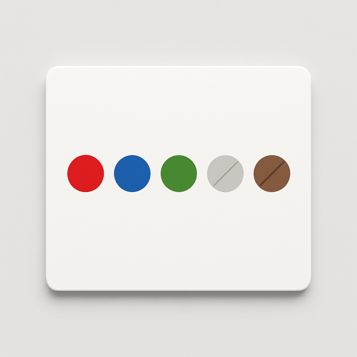
1. Perfect circles
--rubik-swatch-border-radius: 50%;
--rubik-swatch-width: 40px;
Classic circle swatches. Set border-radius to 50% and use equal width. Works for both color and image swatches.
2. Rounded squares
--rubik-swatch-border-radius: 8px;
--rubik-swatch-width: 44px;
Soft corners, modern feel. Looks great with image swatches where you want to show more of the product photo.
3. Sharp squares
--rubik-swatch-border-radius: 0;
--rubik-swatch-width: 48px;
Clean, editorial look. Works well on stores with a minimalist or brutalist design aesthetic.
4. Wide rectangles (polaroid style)
--rubik-swatch-width: 60px;
--rubik-swatch-media-aspect-ratio: 3/4;
--rubik-swatch-border-radius: 4px;
Taller aspect ratio shows more of the product. Good for clothing where you want to see the full silhouette in the swatch thumbnail.
Borders and selected state
5. Thick colored border on selected swatch
--rubik-swatch-active-border-color: #000000;
--rubik-swatch-border-width: 3px;
--rubik-swatch-selected-border-offset: 3px;
Bold black border with a gap between the swatch and the border. The offset creates an “outline” effect that clearly shows which swatch is selected.
6. Colored offset ring
--rubik-swatch-active-border-color: #4A90D9;
--rubik-swatch-selected-border-offset: 4px;
--rubik-swatch-selected-border-offset-color: white;
Blue highlight ring with white gap. The offset color fills the space between the swatch and the selection border. Looks premium.
7. Subtle border on unselected swatches
--rubik-swatch-border-color: #E5E5E5;
--rubik-swatch-border-width: 1px;
--rubik-swatch-active-border-color: #000000;
Light gray border on inactive swatches, black on active. Gives structure without being heavy.
8. No border, shadow instead
Use the custom CSS field in Rubik for box-shadow styling:
.rubik-swatch-item {
  box-shadow: 0 1px 3px rgba(0,0,0,0.12);
}
.rubik-swatch-item[aria-checked="true"] {
  box-shadow: 0 2px 8px rgba(0,0,0,0.25);
}
Elevated look without borders. The selected swatch has a deeper shadow, creating a “lifted” effect.
Sizing and spacing
9. Large swatches for mobile
--rubik-swatch-width: 52px;
--rubik-swatch-grid-gap: 10px;
WCAG recommends 44x44px minimum touch targets. 52px gives comfortable tapping on mobile. The 10px gap prevents accidental taps on neighboring swatches.
10. Compact swatches for products with many options
--rubik-swatch-width: 28px;
--rubik-swatch-grid-gap: 4px;
For products with 20+ colors, compact swatches keep the variant selector from taking over the product page. The trade-off is smaller touch targets on mobile.
11. Single-row horizontal scroll
Use the “one row” preset in Rubik’s style editor. Swatches display in a single horizontal row. On mobile, customers swipe to see more colors. Clean and space-efficient.
Hover and tooltips
12. Enable tooltips on hover
Toggle Show tooltip in Rubik Settings. When a customer hovers over a swatch, a small label appears showing the color name (“Navy Blue”). Helpful when swatches are small or when colors are similar.
13. Scale effect on hover
.rubik-swatch-item:hover {
  transform: scale(1.15);
  transition: transform 0.15s ease;
}
Swatches grow slightly on hover. Gives interactive feedback without changing layout. Add this in the custom CSS field.
Advanced
14. Different styles per device
Rubik has 4 responsive style contexts: product page desktop, product page mobile, product card desktop, product card mobile. Set larger swatches on mobile and smaller on desktop using the visual settings editor. No media queries needed.
15. Use the AI assistant
If CSS is not your thing, open the AI Visual Settings Assistant in Rubik and type what you want:
- “Make swatches circular and bigger”
- “Use a blue border for the selected swatch with a white gap”
- “Switch to a single-row layout with 8 swatches visible”
- “Make the swatches look like buttons with rounded corners”
The AI generates the CSS, shows a live preview, and applies it when you confirm. It controls 70+ style variables without you touching any code.
Watch It in Action
See how to customize swatch appearance:
Frequently asked questions
How do I add custom CSS to Rubik swatches?
Two ways: use the CSS variable fields in the visual settings editor (no code needed, just change values), or add custom CSS in the “Custom CSS” text field for advanced styling like shadows and transforms. Both methods are documented at rubikvariant.com/docs/custom-css.
Will custom swatch CSS conflict with my theme?
No. Rubik renders swatches inside Shadow DOM. Your theme CSS cannot reach inside the Shadow DOM, and your custom swatch CSS stays contained within it. No conflicts in either direction.
Can the AI assistant customize swatches for me?
Yes. Type what you want in plain English. The AI controls 70+ style variables and shows a live preview before applying. No CSS knowledge needed.
Related reading