Product card swatches on mobile Shopify collections
Product card swatches mobile shoppers can tap make a real difference on Shopify collection pages, because most of your traffic is on a phone and most phones never see a hover state. Picture a collection grid of 200 t-shirts, each in eight colors, scrolling under a thumb at 2am. The shopper wants the red one. They shouldn’t have to tap into the product page, wait for it to load, then back out again just to check whether the green exists too.
That round trip is where you lose people. We see it in support all the time: stores with gorgeous variant photos that never show up until someone commits to a full page load. So we built product card swatches into Rubik Variant Images (shipped May 2026), and we designed the mobile behavior first, not as an afterthought.
Here’s the part most blogs get backwards. They treat mobile as the cut-down version of desktop. We think it’s the opposite. The desktop hover preview is the nice-to-have. The mobile tap-to-switch is the thing that actually moves the needle, because that’s where your shoppers live.
This post covers how tap-to-switch works on phones, why we size swatches smaller on cards, how the responsive behavior holds up across themes, and when you’d reach for Rubik Variant Images versus Rubik Combined Listings instead. Let’s get into it.
In this post
- What are product card swatches?
- How tap-to-switch works on mobile
- Why card swatches are sized smaller
- Responsive behavior across themes
- Why mobile shoppers benefit most
- How to turn it on
- RVI card swatches vs combined listings
- Frequently asked questions
- Related reading
What are product card swatches?
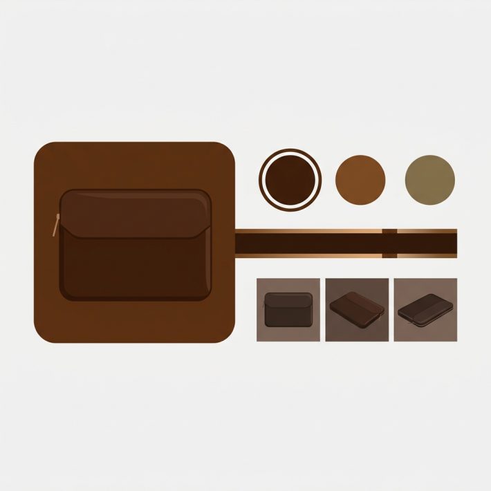
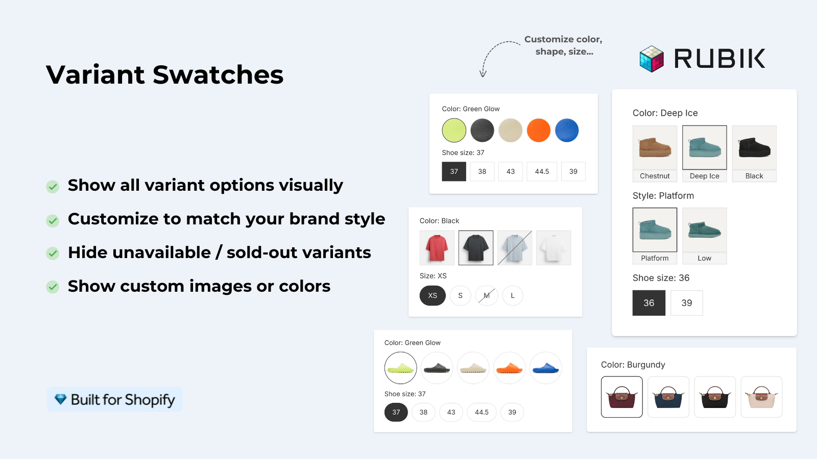
Product card swatches are the small color or image swatches that sit on a product card inside a collection grid, search results page, or homepage feature. Tap or click one and the card’s image swaps to that variant. With Rubik Variant Images these are the variants of one product (one shirt, many colors), rendered right on the card before the shopper opens the product page.
This is new for RVI. For a long time the app worked on the product page only, and we said so loudly. That changed on 26 May 2026. The product card swatches feature is now live for every merchant, which means RVI does show swatches on collection pages now, for the variants of a single product. If you read an older guide of ours saying otherwise, that guide is out of date.
Clicking a swatch swaps the card image. It can also update the card’s price and the add-to-cart link, if you turn those on. On desktop, hovering a swatch previews that variant’s image. On mobile, where hover doesn’t exist, a tap does the same job. More on that next.
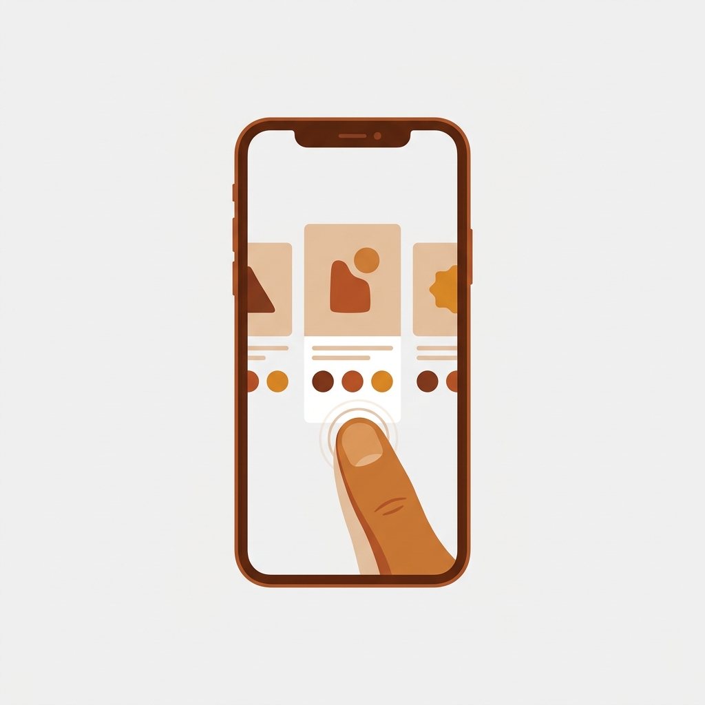
How tap-to-switch works on mobile
On mobile, tapping a swatch on a product card swaps that card’s image to the matching variant, with no page load and no navigation away from the grid. It’s on by default. We designed it this way because phones have no hover state, so the desktop preview pattern simply does nothing on a touchscreen. A tap is the only gesture that works.
Think about what the shopper is actually doing. Thumb on glass, scrolling fast, scanning for a color. If the only way to see the blue version is to open the product page, they have to break their scroll, wait, look, then bounce back. Every one of those steps sheds shoppers. Tap-to-switch collapses the whole thing into a single tap that stays in place.
And because the swap is metafield-based with no external API calls, the variant images load with the page itself. There’s no spinner, no second request to some other server, no jank. The data is already there when the card renders.
One design choice we’ll defend: by default, cards show the first variant option only. If your product has Color and Size, the card shows color swatches, not a wall of every combination. Why? A product card is small. Cramming size and material onto it turns a clean grid into noise. You can change which option shows, but the default keeps cards readable. Want full multi-option control? That lives on the product page, where there’s room. For a deeper look at that side, see our color swatch variant picker setup guide.
Why card swatches are sized smaller
Card swatches default to a smaller size than the swatches on your product page, and that’s deliberate. A product page has room for big, tappable color circles. A collection card sitting two-up in a phone grid does not. Oversized swatches on a card push the title and price around and break the visual rhythm of the grid.
But smaller can’t mean unusable. The swatch still has to be tappable by a thumb. That’s the balance: compact enough to fit a card, big enough that nobody mis-taps the red when they wanted the maroon. You control the exact sizing under the Product Card tab in Swatch style, separate from your product page sizing, so the two never fight each other.
If you’re deciding between round swatches and rectangular button-style swatches on cards, the shape changes how much space each one eats. We broke that down in button swatches vs circle swatches. On a tight mobile grid, small circles usually win on density. Buttons read better when the option is a word like a size rather than a color.
Responsive behavior across themes
Product card swatches render natively on 177+ themes, including Dawn and Horizon, and the responsive behavior adapts to whatever grid your theme uses on small screens. The swatches inherit the card width, so a two-column mobile grid and a four-column desktop grid both get swatches that fit their cards without manual breakpoints from you.
Styling is isolated with Shadow DOM, which matters more than it sounds. Your theme’s CSS can’t accidentally restyle the swatches, and the swatches can’t bleed into your theme. So when your collection grid reflows from four columns to two on a phone, the swatches reflow with the card and don’t pick up some random margin from a theme media query you forgot about.
Running a custom or heavily modified theme that isn’t auto-detected? Support can map it for you. We’ve done this across hundreds of themes already. If swatches aren’t showing up where you expect on a custom build, our color swatches not working fix guide is the first stop, and then support takes over.
For Dawn specifically, the product card grid plays nicely with the default settings. We wrote up the wider Dawn picture in our Dawn theme variant images guide if you’re on the standard free theme.
Why mobile shoppers benefit most
Mobile shoppers benefit most from card swatches because the alternative behaviors that desktop users rely on, hover and a roomy screen, don’t exist on a phone. A desktop user can hover to preview and open multiple tabs. A mobile user has one screen, one thumb, and a short attention span. Card swatches give them the fast path.
Consider the friction math without card swatches on mobile:
- Spot a product in the grid.
- Tap into the product page.
- Wait for it to load.
- Find the color you wanted.
- Decide it’s not it, tap back.
- Wait for the collection to reload and lose your scroll position.
Six steps. With card swatches it’s one tap, in place, scroll preserved. That losing-your-scroll-position step is the silent killer, by the way. Few things annoy a mobile shopper more than scrolling back through 80 products to find where they were.
There’s a support angle too. Showing the real color on the card before the click means fewer “is this the actual shade?” questions and fewer wrong-color orders. Three things tend to improve at once: discovery, confidence, and your inbox. Honestly, the inbox one is underrated.
“We’ve tried several solutions for managing variant images, but Rubik Variant Images stands out. It’s like giving our product pages a much-needed declutter. Customers now see only the images that match their selection, which has noticeably reduced the ‘Is this the right color?’ support queries. The setup was intuitive, and the results were instant. It’s one of those behind-the-scenes tools that quietly makes a big difference. Love it!”
Livspace Home, India, 2025-07-10, Rubik Variant Images on the Shopify App Store
How to turn it on
Product card swatches are disabled by default, so you opt in. Open the Swatch settings page in Rubik Variant Images and flip the toggle labelled “Enable on product cards.” Then jump to Swatch style and use the Product Card tab to set the sizing, shape, and which option shows. That’s the whole setup.
- Enable: Swatch settings page, toggle “Enable on product cards” on.
- Style: Swatch style, then the Product Card tab (separate from product page styling).
- Behavior: desktop click-to-switch and mobile tap-to-switch are on by default; hover preview is desktop-only.
- Optional: let a swatch click also update card price and add-to-cart link.
Before any of this shows up, your variants need images assigned. If you haven’t done that yet, you’ve got two fast routes: AI auto-assign handles one product at a time by reading the title, option values, filenames, and alt text, while bulk assign works across hundreds of products using your gallery image order. Pick one, assign images, then enable the cards.
RVI card swatches vs combined listings
Use Rubik Variant Images card swatches when each color is a variant of one product. Use Rubik Combined Listings when each color is its own separate product with its own URL. The split is about how your catalog is structured, not which app is better, and plenty of stores run both together.
| Question | Rubik Variant Images (card swatches) | Rubik Combined Listings |
|---|---|---|
| Catalog structure | One product, many variants | Separate products per color |
| What swatches link | Variants of a single product | Distinct products grouped together |
| Each color gets own URL | No (shared product URL) | Yes (own URL, title, images) |
| Best for SEO per color | Less | More |
| Past Shopify variant limit | Limited by variants per product | No variant ceiling per group |
| Mobile tap-to-switch on cards | Yes | Yes |
Quick rule of thumb. Variants of one product? RVI. Separate products you want to feel like one? RCL. If you want each color page to rank on its own and dodge the variant ceiling, the combined listings route is the stronger play, and we cover that in depth on the rubikify guide to collection page swatch display. For the bigger picture on adding swatches across your store, the team at Craftshift wrote up the best Shopify color swatch app comparison for 2026.
See it live on the Rubik Variant Images demo store, watch the tutorial video, or read the getting started guide. Comparing the separate-products route too? Try the Combined Listings demo store and its docs.
Frequently asked questions
Does Rubik Variant Images work on collection pages now?
Yes. Since 26 May 2026, the product card swatches feature shows variant swatches on product cards across collection pages, search results, and home pages. It covers the variants of a single product. Older guides that say RVI is product page only are out of date.
Can mobile shoppers tap swatches to change the card image?
Yes. Mobile tap-to-switch is on by default. Tapping a swatch swaps the card’s image to that variant with no page reload. On desktop a click does the same, and hovering previews the image. Phones get the tap because they have no hover state.
How do I make card swatches smaller on mobile?
Card swatches already default to a smaller size than product page swatches. To adjust them, go to Swatch style and open the Product Card tab, which controls card sizing separately from your product page. Keep them compact but still large enough to tap with a thumb.
Which themes support product card swatches?
Card swatches render natively on 177+ themes, including Dawn and Horizon. Styling is isolated with Shadow DOM so it adapts to your grid without conflicts. Custom or heavily modified themes that aren’t auto-detected can be mapped by support.
Should I use card swatches or combined listings?
Use Rubik Variant Images card swatches when colors are variants of one product. Use Rubik Combined Listings when each color is a separate product with its own URL, which is better for SEO and gets past the per-product variant limit. Many stores run both.
Related reading
- How to add color swatches on Shopify
- Shopify collection page color swatches
- How many images per variant on Shopify
- Best Shopify variant image apps 2026 review
- Collection page swatch display guide (rubikify)
So here’s the question worth sitting with: how many mobile shoppers bounced off your collection grid last week because they couldn’t see the color they wanted without a full page load? Flip the toggle, assign your variant images, and find out.