Swap product card images when clicking a swatch on Shopify
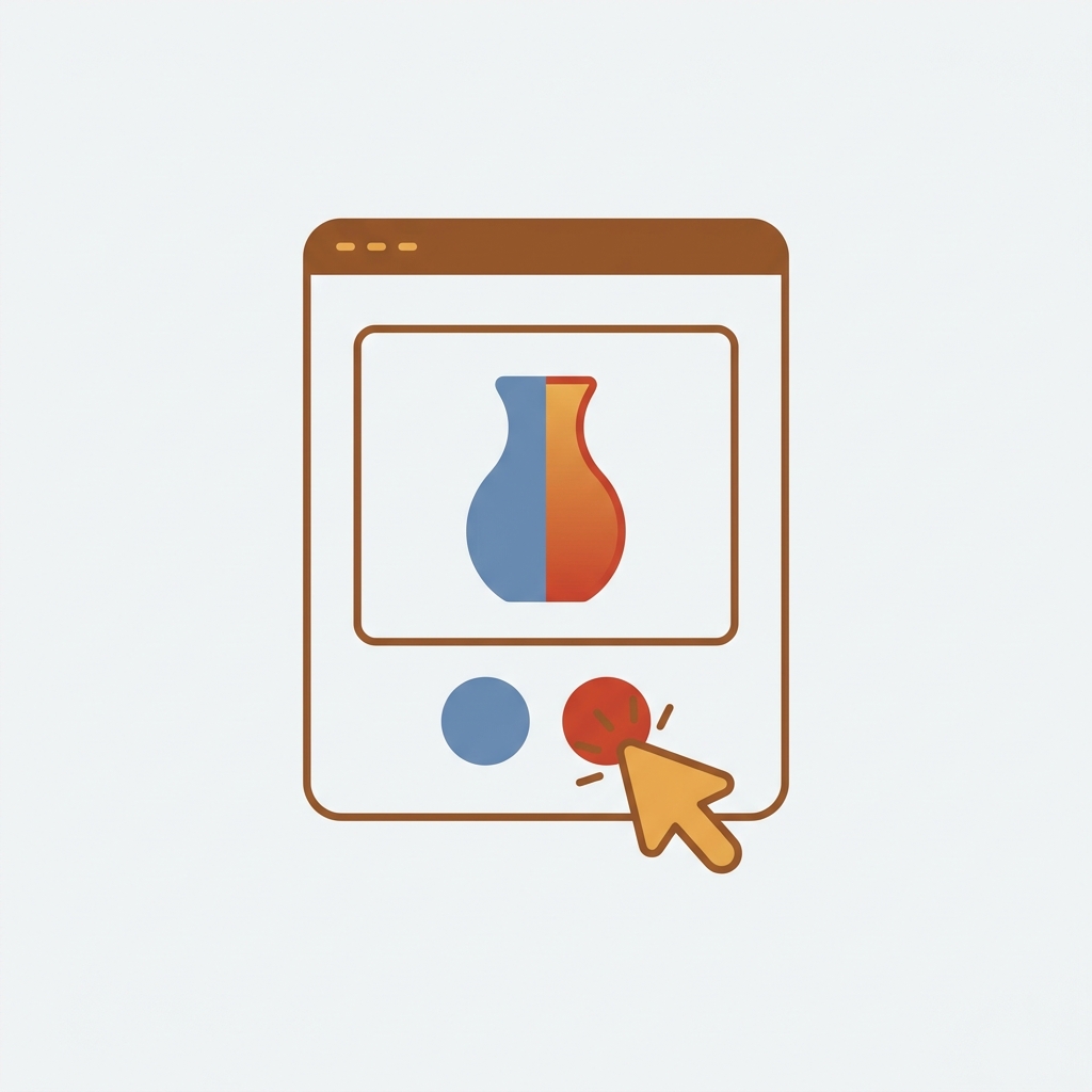
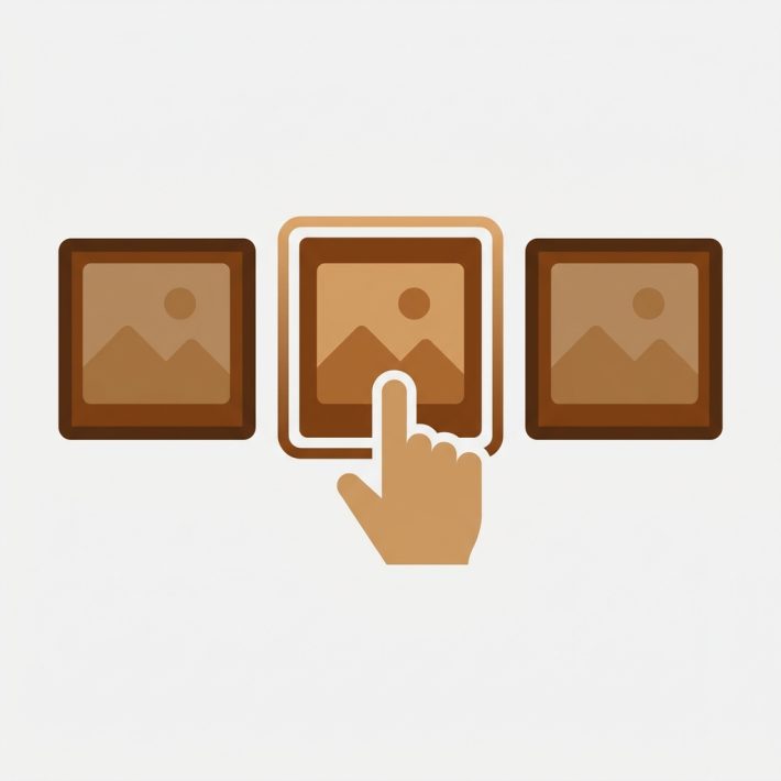
Want to swap product card image when a shopper clicks a color swatch right on a collection page? You can, and it changes how people browse. Picture a store with 40 shirts, each in 8 colors. A shopper lands on the collection grid, sees a navy card, hovers a red swatch, and the photo flips to red before they ever click into the product. That tiny interaction does a lot of quiet work.
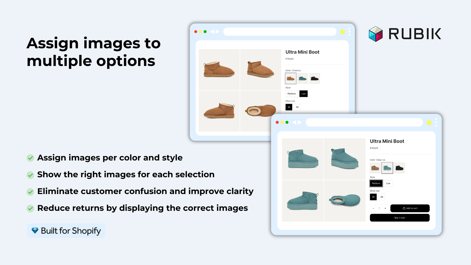
We shipped product card swatches in Rubik Variant Images on May 26, 2026, and it is live for every merchant now. Before that, our swatches lived on the product page only. That line in our old docs (RVI is product page only) is now outdated. The app shows swatches on product cards too, across collection pages, search results, and home page product blocks.
So what actually happens on click? The card image swaps to the selected variant. Optionally, the card price updates, and the add-to-cart link points at the right variant. Hovering previews the image without committing to a click. All of it is configurable, and all of it is off by default until you opt in. We made that choice on purpose, and I will explain why below.
This guide covers the click and hover swap, price and cart updates, desktop click versus mobile tap, and the apply-on-load setting that decides which variant the card shows when the page first paints. Let’s get into it.
In this post
- What product card swatches do on Shopify
- How to swap product card image on swatch click
- Updating price and add-to-cart on swatch click
- Desktop click, hover preview, and mobile tap
- Apply-on-load and which variant shows first
- Card swatches for one product vs separate products
- Frequently asked questions
- Related reading
What product card swatches do on Shopify
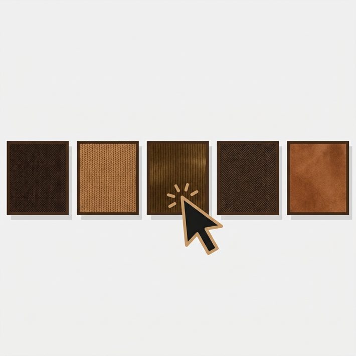
Product card swatches put a row of variant swatches directly on each product card across listing pages. Click a swatch and the card swaps to that variant’s image. Hover and the card previews it. The swatches show the variants of one product (one shirt in many colors), not separate products linked together.
This is the part that confuses people, so I will be blunt. These swatches belong to a single product. If your navy shirt and red shirt are the same Shopify product with a Color option, product card swatches are exactly right. If each color is a separate product with its own URL, that is a different tool (more on that later).
The feature is metafield-based with no external API calls, so the swatch data loads with the page itself. It works natively on 177+ themes including Dawn and Horizon. Got a custom theme? Support can map it for you. No millisecond promises here, just no server round-trips slowing the grid down.
How to swap product card image on swatch click
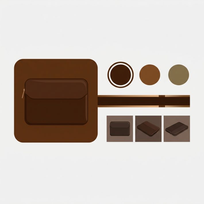
To swap product card image on swatch click, open Rubik Variant Images, go to the Swatch settings page, and turn on the toggle labeled Enable on product cards. It’s disabled by default, so nothing changes on your store until you flip it. Styling for the cards lives under the Swatch style tab, in the Product Card section.
Here is the short version of the setup:
- Make sure your variants already have images assigned (drag-drop manually, or use AI auto-assign per product, or run bulk assign across the whole catalog).
- Open Swatch settings and toggle Enable on product cards.
- Go to Swatch style, then the Product Card tab, and set shape, size, and spacing.
- Decide if price and add-to-cart should update on click.
- Check it on a real collection page, then on a phone.
Why is it off by default? Because product cards are tight spaces, and a wall of swatches can clutter a clean grid fast. We would rather you opt in and tune it than have us force a busy layout onto your collection page. By default the cards also show the first variant option only, which keeps things calm. If your shirts have Color and Size, the cards show colors. Size belongs on the product page, where there is room for it.
Updating price and add-to-cart on swatch click
Yes, clicking a swatch can also update the card’s price and its add-to-cart link, not just the image. This matters when variants are priced differently, say a plain tee at $24 and a printed tee at $29. Without it, a shopper sees the wrong number, gets to checkout, and feels misled. Both updates are configurable, so you turn them on if they fit your catalog.
Think of the card as a tiny product page. Three things can react to a swatch click: the image, the price, and the cart link. You can enable any combination.
| What updates | On swatch click | When to enable it |
|---|---|---|
| Card image | Swaps to the selected variant photo | Always (this is the point) |
| Card price | Shows the selected variant’s price | When variants are priced differently |
| Add-to-cart link | Points at the selected variant | When you have quick-add buttons on cards |
| Hover preview | Previews the image, no commit | Desktop browsing, fast scanning |
If your store uses quick-add buttons on collection cards, the add-to-cart update is the one I would not skip. A shopper picks red, hits add, and the right variant lands in the cart. No surprise at checkout. That’s the whole game.
Desktop click, hover preview, and mobile tap
Desktop and mobile need different behavior, so the app handles them separately. On desktop, click-to-switch and hover-to-preview are both on by default. On mobile, there is no hover, so tap-to-switch is on by default instead. You don’t have to wire any of this up by hand. It just behaves correctly per device.
Why split them? Because hover does not exist on a phone, and pretending it does breaks the interaction. A merchant who only tests on a laptop ships a great desktop experience and a confusing mobile one. We have seen that pattern enough in support to bake the split in from day one.
- Desktop click: commits the swap. Image, and optionally price and cart, update and stay.
- Desktop hover: previews the image only, reverts when the cursor leaves.
- Mobile tap: acts like a desktop click, since there is no hover state to lean on.
- Smaller swatches on cards: cards use smaller swatch sizes than the product page by default, so the grid stays tidy.
- First option only: by default cards show the first option (usually color) to avoid clutter.
Always check it on an actual phone, not just a browser resize. Tap targets feel different under a thumb. If you want a refresher on swatch shapes before you style the cards, our guide on button swatches vs circle swatches covers the tradeoffs.
Apply-on-load and which variant shows first
Apply-on-load decides which variant the card shows the moment the page first paints, before anyone clicks. By default a card shows its first variant option, which keeps the grid consistent and clean. The swatches then let shoppers swap from there. So the starting state is predictable, and the interaction layers on top.
Does that mean every card looks identical at load? No, each card shows its own product’s first variant, so a navy-first shirt and a black-first jacket each paint their own default. The point is that the load state is deterministic, not random. A shopper who refreshes sees the same starting image, every time.
One honest opinion: do not over-engineer the load state. The strongest collection pages I have seen keep a calm default and let the swatch click carry the interaction. A grid where every card is mid-animation on load feels frantic. Clean first, clever second. If you also run swatches on the collection page across separate products, plan how the two layers coexist so they don’t fight for attention.
“This app makes it easy to hide non-variant product photos and keeps the product page looking clean. It also helps to show clean custom swatches. Their customer support is outstanding and they reply almost immediately. They were able to fix a bug for me with minimal weight time.”
Anonymous merchant, 2026-02-18, Rubik Variant Images on the Shopify App Store
Card swatches for one product vs separate products
Use product card swatches when colors are variants of one Shopify product. Use Rubik Combined Listings when each color is its own separate product with its own URL. Same swatch experience on the grid, very different data model underneath. Picking the wrong one is the most common setup mistake we see.
| Situation | Use this | Why |
|---|---|---|
| One product, many color variants | Rubik Variant Images product card swatches | Swatches map to variants of a single product |
| Each color is a separate product | Rubik Combined Listings | Unique URLs, no 2,048 variant limit, better SEO |
| Both at once | Both apps together | Card swatches per product, plus grouped separate products |
Plenty of stores run both. RVI handles the per-product image swap on the card and on the product page, while Combined Listings groups separate products and shows swatches across them on the collection page. If you are weighing options across the category, our roundup of the best Shopify variant image apps for 2026 lays out where each tool fits, and the best Shopify color swatch app guide goes broader on swatch strategy.
Running into trouble where swatches don’t appear at all? Start with our color swatches not working fix, then confirm your theme in the Dawn theme variant images walkthrough.
See it live in the Rubik Variant Images demo store, watch the tutorial video, or read the getting started guide. For separate-product grouping, check the Combined Listings demo and its docs.
Frequently asked questions
Does clicking a swatch update the price on the product card?
Yes, if you enable it. Rubik Variant Images can update the card’s price and add-to-cart link when a shopper clicks a swatch, not just the image. It’s configurable, so turn it on when your variants are priced differently and leave it off when they all cost the same.
How do I enable product card swatches in Rubik Variant Images?
Open the app, go to the Swatch settings page, and turn on Enable on product cards. It’s off by default. Then style the cards under the Swatch style tab in the Product Card section. Card swatches work natively on 177+ themes including Dawn and Horizon.
What is the difference between desktop click and mobile tap?
On desktop, click commits the image swap and hover previews it, both on by default. On mobile there is no hover, so tap-to-switch is on by default and acts like a desktop click. You don’t configure this per device by hand; the app applies the right behavior automatically.
Which variant shows on the card when the page loads?
By default each card shows its first variant option at load, usually color, which keeps the grid clean and predictable. The swatches then let shoppers swap from that starting state. The load state is deterministic, so a refresh shows the same starting image every time.
Can I swap card images when each color is a separate product?
Not with product card swatches alone, since those map to variants of one product. When each color is its own separate product with its own URL, use Rubik Combined Listings to group them and show swatches across the separate products. Many stores run both apps together.
Related reading