Too many color swatches on Shopify? Keep it clean
Too many color swatches on a Shopify product page do real damage: the row wraps into three messy lines, the add to cart button gets shoved below the fold, and on mobile the whole thing turns into a wall of dots nobody wants to scan. If a product has 30 or 50 colors, the default swatch layout most themes ship with just gives up. This post is about fixing that without dumping everything into an ugly dropdown.
Picture a paint store with 48 shades of one wall color. Or a yarn shop with 60 colorways of the same weight. Or a phone case brand running 24 colors across one model. The product is fine. The catalog is fine. It’s the swatch row that breaks.
Here’s the opinion up front, and some people will hate it: a dropdown for color is wrong. You’re hiding the most visual decision a shopper makes behind a click. But 50 raw circle swatches stacked four rows deep is also wrong. The answer sits in the middle, and it’s mostly layout work, not a redesign.
In this post
- When too many swatches actually hurt conversion
- Swatch size and shape: the first lever
- Rows, horizontal scroll, or a show more expander
- Grouping by color family
- Hiding sold out to shrink the row
- Accessibility and tap target size
- How Rubik Variant Images controls the layout
- Frequently asked questions
When too many color swatches actually hurt conversion
Too many color swatches hurt conversion the moment the row pushes your price and your add to cart button out of view. That’s the real cost. A shopper lands, sees a grid of dots, has to scroll past it to find the buy button, and some of them just leave. The swatches were supposed to help. Instead they became a wall.
There are a few specific failure modes worth naming, because they’re different problems with different fixes:
- Awkward wrapping. 38 swatches at a default size wrap into four or five ragged rows. The last row has two lonely dots. It looks broken even when it isn’t.
- Buy button below the fold. Every extra swatch row eats vertical space. On a laptop that’s annoying. On a phone it’s a real conversion leak.
- Scanning fatigue. Past roughly two dozen options, people stop reading and start guessing. Hick’s law is real: more choices, slower decisions.
- Mobile clutter. A 48 dot grid that looks tidy on a 1440px desktop becomes a cramped, mis-tappable mess on a 390px screen.
So when does the count actually become a problem? There’s no magic number, but in practice the row starts feeling heavy somewhere around 15 to 20 swatches at typical sizes, and it needs a real strategy past 30. Below 12 or so, you can usually leave it alone. Know which bucket your product is in before you start tweaking.

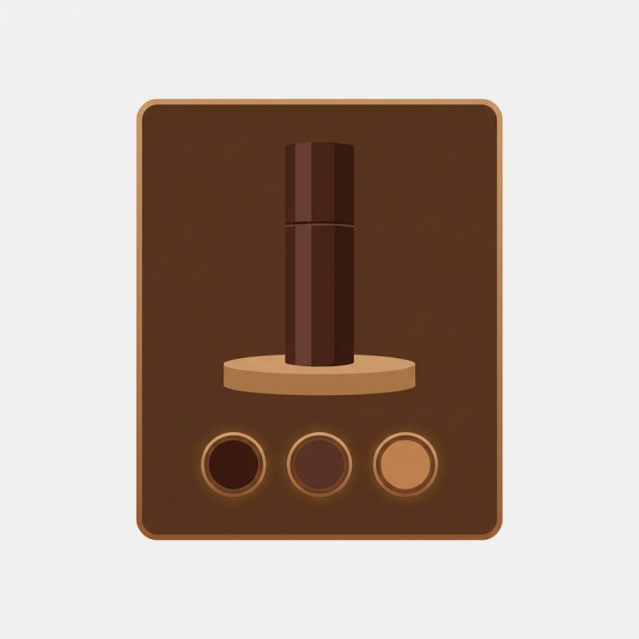
Swatch size and shape: the first lever
Before you reach for any clever trick, change the size. It’s the fastest win. A 48px swatch and a 28px swatch fit a wildly different number of options per row, and most themes default to something bigger than a busy catalog needs. Shrinking each swatch by ten pixels can collapse a five row mess into two clean rows.
Shape matters too, and not just for looks. Here’s the rough trade off:
- Circles read as “color” instantly. They’re the friendliest for pure color picking, but round shapes waste a bit of horizontal space because of the gaps between them.
- Squares and rounded squares pack tighter. You get more per row, and the color fills more of the visible area, which helps when colors are close (think six shades of grey).
- Pills and buttons work when the label matters more than the hue, like “Charcoal” vs “Slate” where the dots alone won’t tell them apart.
For a 40 color product, I’d reach for small rounded squares almost every time. They scan fast, they tile neatly, and the corners give your eye a grid to follow. Circles are prettier with eight colors. With forty, neat beats pretty. If you want the full rundown on each shape, we wrote a whole guide to Shopify swatch shapes, and a separate piece on button swatches vs circle swatches if you’re stuck between those two.
Rows, horizontal scroll, or a show more expander
Once size and shape are sorted, you decide how the row behaves when it still overflows. Three patterns, each with a real cost. Don’t pick on vibes, pick on what your shoppers do.
| Pattern | Good for | The catch |
|---|---|---|
| Wrap into more rows | Up to ~20 swatches, where seeing all of them at once helps | Pushes the buy button down fast on mobile |
| Horizontal scroll (single row) | Many colors where the buy button must stay put | Hidden options off screen get fewer clicks. Add a fade or arrow hint. |
| Show more expander | 30+ colors. Show the first 8 to 12, hide the rest behind a tap | The hidden colors get less love. Put your bestsellers in the visible set. |
My honest take? For huge counts, the show more expander usually wins. You keep the page short, the buy button stays high, and curious shoppers can still see everything with one tap. Just be deliberate about which colors sit “above the fold” of the swatch row, because those are the ones that sell. Horizontal scroll is a close second, but only if you add a visible cue that there’s more to the right. A swatch row with no scroll hint is a swatch row half your traffic never finishes reading.
Grouping by color family
When you’ve got 50 colors, a flat row in random order is brutal to scan. Group them. Reds near reds, blues near blues, neutrals together. Even without sub headers, just ordering the swatches by hue turns a chaotic grid into something the eye can sweep in seconds.
How do you actually do this? It comes down to the order of your variant option values in Shopify and how your swatches inherit that order. Sort the option values into color families (light to dark within each family is a nice touch), and a well behaved swatch row will follow. No code, no theme gymnastics, just thoughtful ordering. If you want the bigger picture on arranging colors for shoppers, our Shopify swatch design guide covers ordering, spacing, and contrast in one place.
One more thing on grouping. If those 50 colors are actually 50 separate products (one product per color, each with its own URL for SEO), that’s a different setup entirely. Showing swatches across separate products on the collection page is the job of grouping, and our team built no code collection page swatches for exactly that. Rubik Variant Images handles the product page; product grouping across collection cards is Rubik Combined Listings. Keep those two straight and you’ll save yourself a headache.
Hiding sold out to shrink the row
The easiest way to shrink a 50 swatch row? Stop showing the colors nobody can buy. If 15 of your 50 colorways are out of stock, hiding them drops you from a five row mess to something that fits in two or three. Cleaner row, less scrolling, and no shopper falls in love with a dead variant.
This is one of those settings I genuinely don’t understand why themes default to OFF. Why show a grayed out swatch for a color that’s been sold out for three weeks? It just adds noise and frustration. There’s a real debate here (greying out keeps shoppers aware a color exists and might restock, fully hiding keeps the row tight), and the right call depends on whether you restock. For a tight catalog with frequent restocks, grey them. For a sprawling 50 color row, hide them and breathe. We go deep on the trade offs in how to hide sold out variant swatches.
Accessibility and tap target size
Here’s where shrinking swatches bites you back. Make them too small and you fail accessibility, plus you annoy every thumb on mobile. The widely cited minimum tap target is 44 by 44 CSS pixels (Apple’s guideline) or about 48 by 48 (Google’s). Squeeze 50 swatches into one row by dropping each to 20px and you’ve technically broken the touch experience.
The fix isn’t to make the colored dot itself 44px. It’s to give each swatch enough padding so the tappable area hits the minimum even if the visible color is smaller. A 28px dot with comfortable padding can still present a 44px hit zone. So you get a compact look without sabotaging anyone with shaky hands or fat fingers (all of us, sometimes). A few accessibility basics worth keeping:
- Tap targets at or above 44px, even when the visible swatch is smaller.
- A clear selected state that doesn’t rely on color alone (a ring or checkmark), since color blind shoppers can’t tell two close hues apart.
- Readable labels or accessible names so screen readers announce “Forest Green” not “option 23”.
How Rubik Variant Images controls the layout
Rubik Variant Images gives you the styling controls to do everything above without touching theme code. It renders swatches on the Shopify product page (and product card swatches on collection and search pages for that one product’s variants) and filters the gallery so the selected color shows only its own images. The point: shape it, size it, trim it, all from a visual editor.
On the layout side, here’s what the app actually does:
- Five swatch shapes: circle, square, rounded square, pill, and button. Mixable across options, so Color can be rounded squares while Size stays as pill buttons.
- Size control: set swatch dimensions so a 40 color row tiles into two clean lines instead of five ragged ones.
- 100+ CSS variables: spacing, padding, selected state, border radius, and the tap zone are all editable, through the visual settings or your own custom CSS for fine control.
- Hide unavailable variants: drop sold out swatches (and their thumbnails) out of the row entirely, which is the single biggest space saver for a huge color list.
- Shadow DOM rendering: the swatch styles are isolated from your theme’s CSS, so your tweaks won’t fight the theme and the theme won’t override your swatches.
We built the styling around CSS variables on purpose. A merchant with 50 colors needs different spacing math than one with six, and hard coded sizes would force everyone into the same box. The custom CSS layer is there for the edge cases, the kind we cover in our swatch CSS customization ideas. And because it loads from metafields with no external API calls, the swatch styling renders with the page rather than waiting on a server somewhere. A 50 color row shouldn’t also be a slow row.
“This is now the best app I have for Shopify. It was so easy to set up and customize the design elements to match our site. […] We also sell a lot of one-of-a-kind variants (stock of 1 item per variant), so sometimes we have 20 variants for a given product. […] Now with Rubik, we hide all unavailable variants AND their thumbnails both at once.”
The Amma Shop, February 2025, Rubik Variant Images on the Shopify App Store
If your big color list also pairs with a strategy question (do you split colors into separate products, or keep them as variants?), our friends at Craftshift wrote a broader Shopify swatch design guide that zooms out to the whole catalog decision.
Want to see it first? Check the live variant images demo store, watch the tutorial video, or read the getting started guide.
Frequently asked questions
How many color swatches are too many on a product page?
There’s no hard limit, but the swatch row starts feeling heavy around 15 to 20 colors at typical sizes and needs a real layout strategy past 30. Below a dozen you can usually leave the default alone. Past that, shrink the swatches, group by color family, and consider a show more expander.
Should I use a dropdown instead of swatches for lots of colors?
No. A dropdown hides the most visual choice a shopper makes behind a click, which kills the browsing experience. A better fix for a long color list is smaller swatches, grouping by hue, and a show more expander that keeps the row short while still letting people see every option.
How do I stop swatches from pushing the buy button below the fold on mobile?
Shrink each swatch, hide sold out colors to cut the row count, and use a show more expander or a single horizontal scroll row so the swatches take one or two lines instead of five. Keeping the row compact keeps your price and add to cart button high on the screen.
What is the minimum tap target size for swatches?
Aim for at least 44 by 44 CSS pixels (Apple’s guideline) or roughly 48 by 48 (Google’s). The visible color dot can be smaller, as long as you add padding so the tappable area still hits the minimum. That lets you keep a compact look without making swatches hard to tap.
Which swatch shape is best when I have a lot of colors?
Small rounded squares are usually the best pick for big color counts. They tile tightly, fit more per row than circles, and fill more visible area so close shades are easier to tell apart. Rubik Variant Images supports circle, square, rounded square, pill, and button shapes.
Does hiding sold out swatches actually help the layout?
Yes, it’s often the single biggest space saver. If a chunk of your colorways are out of stock, removing them from the row can cut several lines of swatches at once. Rubik Variant Images can hide unavailable variants and their thumbnails together, so the row only shows colors people can buy.
Can Rubik Variant Images show swatches for separate color products on the collection page?
Rubik Variant Images shows swatches for one product’s own variants, including product card swatches on collection and search pages. If each color is a separate product with its own URL and you want them grouped under one card, that’s Rubik Combined Listings, which handles collection page swatches across separate products.
Related reading
- Shopify swatch shapes guide: circle, square, pill, and button
- Shopify swatch design guide
- Shopify swatch CSS customization ideas
- How to hide sold out variant swatches on Shopify
- Button swatches vs circle swatches on Shopify
- Craftshift: the full Shopify swatch design guide
- Rubikify: no code collection page swatches
Pick one product with your worst swatch row, shrink the swatches, hide the sold out colors, and see how much shorter the page gets. That’s usually the ten minute fix that does the most.