Image swatches vs color swatches on Shopify
You are setting up swatches for your Shopify store and you hit the first real question: should you use solid color circles or tiny product photos? Color swatches are clean and fast to scan. Image swatches show the actual product. Both work. But the right choice depends on what you sell.
This post breaks down when to use each, when to mix them, and how Rubik Variant Images determines swatch type automatically based on the data you provide.
In this post
- Color swatches explained
- Image swatches explained
- When to use which
- The mixed approach: both on the same product
- Two-color swatches for multi-toned products
- How Rubik determines swatch type automatically
- Setup: choosing your swatch type in Rubik
- Video walkthrough
- Frequently asked questions
- Related reading
Color swatches explained
A color swatch is a solid circle (or square, depending on your CSS) filled with a single hex value. Red is #FF0000. Navy is #001F3F. Black is #000000. The browser renders a small filled shape and the customer clicks it to select that variant.
Pros of color swatches
- Fast to scan. A row of 20 solid color circles is easy to process at a glance. Customers find their color in under a second.
- Clean and minimal. Solid circles take less visual space than product thumbnails. If your store design is minimal, color swatches fit right in.
- Lightweight. No image files to load. The hex value renders instantly with zero network requests.
- Easy to maintain. Set the hex once in a metaobject or metafield and it applies everywhere that color appears.
Cons of color swatches
- Cannot show patterns. A plaid shirt has multiple colors. No single hex value represents it.
- Cannot show texture. Linen, velvet, and canvas all look the same as a flat circle.
- Ambiguous names. “Ocean Mist” and “Seafoam” might look identical as hex circles. The customer has to click each one to see the difference in the product gallery.
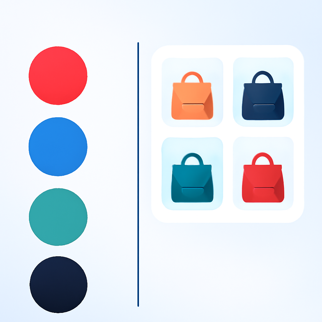
Image swatches explained
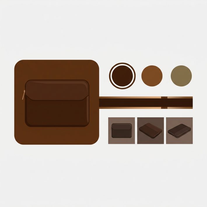
An image swatch replaces the solid color circle with a miniature product photo. Instead of seeing a hex-filled dot, the customer sees a tiny version of the actual product in that color, pattern, or material. The image usually comes from a metaobject entry or a custom uploaded file.
Pros of image swatches
- Shows the real product. Customers see the actual fabric, pattern, or finish before clicking. No guessing.
- Handles patterns and prints. A plaid flannel shirt can show the plaid pattern right in the swatch. A floral dress can show the floral print.
- Differentiates similar shades. When you have five shades of blue, image swatches let customers see the actual difference without clicking through each one.
- Reduces returns. Customers know exactly what they are getting. The swatch shows the product, not an approximation of its color.
Cons of image swatches
- Larger visual footprint. Product thumbnails need a bit more space to be readable. A row of 20 image swatches can feel crowded.
- Requires images. You need a swatch image for every variant. If you have 30 colors, that is 30 images to upload and maintain.
- Slightly slower to scan. Each swatch contains visual detail. Solid color circles are faster to process when customers already know what color they want.
When to use which
The decision comes down to one question: does a hex circle tell the full story? If yes, use color swatches. If not, use image swatches.
Here are practical examples:
- A solid navy blue jacket: color swatch. One hex value communicates the color perfectly.
- A plaid flannel shirt: image swatch. No single hex represents the plaid pattern.
- A phone case in Red, Blue, Black, White: color swatches. Standard solid colors, fast to scan.
- A linen sofa in “Oatmeal,” “Stone,” and “Fog”: image swatches. The names are ambiguous and texture matters.
- A running shoe in 25 colorways: image swatches. Each colorway combines multiple colors and materials.
- A plain cotton t-shirt in 15 solid colors: color swatches. Clean, fast, and the hex tells the full story.
For a broader look at how swatches compare to dropdowns in general, see this comparison on CraftShift.
Decision by product type
Fashion and apparel. Image swatches for items with prints, patterns, or textured fabrics. Color swatches for basic solid-color tees, underwear, and socks.
Furniture and home decor. Image swatches almost always. Upholstery texture and fabric weave matter. “Charcoal” on a velvet sofa looks different from “Charcoal” on a linen one.
Electronics and accessories. Color swatches usually work fine. Phone cases, laptop sleeves, and watch bands in solid colors do not need product photos in the swatch.
Jewelry. Image swatches for gemstones and mixed metals. Color swatches for simple gold/silver/rose gold options.
The mixed approach: both on the same product
You do not have to pick one or the other for your entire store. Rubik lets you mix swatch types on the same product. Show image swatches for the Color option and text pill buttons for the Size option. Or color circles for Metal and image swatches for Stone.
This matters because different options on the same product need different visual treatments. Color is visual and benefits from images or color fills. Size is not visual and works better as text. Forcing both into the same format always creates a compromise.
The swatch_show_without_images setting controls what happens when a variant has no swatch image assigned. Instead of showing a broken placeholder, Rubik falls back to a color circle (if hex data exists) or a text pill. This means you can upload images for some variants and let the rest fall back gracefully.
For more on how to handle this fallback behavior and style your swatches, check the CSS customization guide.
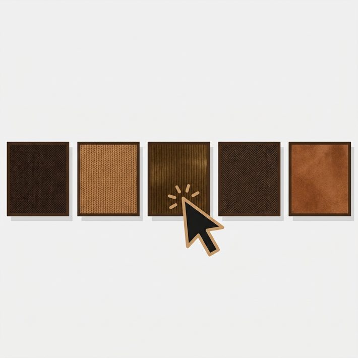
Two-color swatches for multi-toned products
Some products are not one solid color. A sneaker with a white sole and a colored upper. A two-tone handbag. A mug that is one color outside and another inside. A single hex value cannot represent these.
Rubik supports primary and secondary color values in the swatch circle. The swatch renders as a split circle: half primary color, half secondary color. This gives customers an instant visual cue without needing a full product photo in the swatch.
Two-color swatches sit between color swatches and image swatches in terms of visual information. They communicate more than a single hex value but load faster than an image file. Use them when the product is genuinely two-toned and both colors matter to the buying decision.
How Rubik determines swatch type automatically
You do not always have to choose manually. Rubik follows a data priority chain to decide how each swatch renders:
- Image in metaobject. If the variant’s metaobject entry contains a swatch image, Rubik renders an image swatch. This takes highest priority.
- Color hex value. If no image exists but a hex color is defined in the metaobject, Rubik renders a solid color circle. If both primary and secondary colors are set, it renders a two-color split swatch.
- Text pill fallback. If neither image nor hex data exists, Rubik falls back to a text pill showing the option value name (like “Red” or “Large”).
This cascade means you can mix swatch types within a single option without extra configuration. Upload images for the variants where it matters and let the rest fall back to color circles or pills. The color accuracy guide on CraftShift covers how to pick the right hex values so your color swatches match the actual product.
Setup: choosing your swatch type in Rubik
Setting up swatches in Rubik takes a few steps:
- Open the product in Rubik Variant Images.
- Go to the swatch settings for the option you want to configure (Color, Size, Material, etc.).
- For image swatches: upload a swatch image in the metaobject entry for each option value. Use a close-up crop of the product in that color or pattern.
- For color swatches: enter the hex code in the metaobject entry. Add a secondary hex if the product is two-toned.
- For text pills: leave both image and hex empty. Rubik renders the option value name as a clickable pill.
You can mix all three types within the same option. Some variants get images, some get color fills, and some fall back to text. Rubik handles the rendering automatically based on what data is present. For step-by-step instructions, see the documentation.
If you want to show these swatches on collection pages as well, that requires a different approach. Read about collection page color swatches for the full setup.
A note on conversions
Image swatches show more product detail upfront. Customers see the actual item before clicking, which means fewer surprises after adding to cart and fewer returns after delivery. This matters most for high-value items where the wrong shade or pattern triggers a return.
Color swatches are faster to scan. When customers already know what color they want, solid circles let them find it quickly and move to checkout. This matters for stores with large variant counts and repeat buyers.
For data on how different swatch approaches affect conversion rates, see this analysis on CraftShift. The short version: image swatches tend to lower return rates while color swatches tend to speed up time-to-purchase. The best approach is often a mix of both.
Video walkthrough
See how to add custom images to your variant selector swatches in Rubik:
Frequently asked questions
Should I use image swatches or color swatches on Shopify?
Use color swatches for solid, single-color products where a hex value accurately represents the option. Use image swatches for patterned, textured, or multi-color items where a single hex cannot tell the full story. You can mix both on the same product.
Can I use image swatches and color swatches on the same product?
Yes. Rubik Variant Images supports mixed swatch types on the same product and even within the same option. Upload an image for variants that need it and set a hex code for the rest. Rubik renders each one based on the data available.
Do image swatches convert better than color swatches?
Image swatches tend to reduce return rates because customers see the actual product before buying. Color swatches tend to speed up purchase decisions because they are faster to scan. The best conversion results often come from using both: image swatches where detail matters and color swatches where simplicity helps.
What happens if I do not upload a swatch image?
Rubik follows a fallback chain. If no image exists, it checks for a hex color value and renders a color circle. If no hex exists either, it renders a text pill with the option value name. You do not get broken placeholders.
What are two-color swatches?
Two-color swatches display a split circle with a primary and secondary hex value. They are useful for products that are genuinely two-toned, like a shoe with a white sole and colored upper. Set both colors in the metaobject entry and Rubik renders the split automatically.
Related reading
- How to show different swatch types for different options
- 15 ways to customize your Shopify variant swatches with CSS
- How to show only the selected variant’s images
- Rubik Variant Images FAQ
- How to add color swatches to Shopify
- How to hide sold-out variant swatches
- Color swatches on Shopify collection pages
- Swatches or dropdowns? What the data says (CraftShift)
- Customize combined listing swatches (Rubikify)