Shopify product card swatches: show variant colors on collection pages
Shopify product card swatches are the little color or image dots that sit on a product card in a collection grid, search result, or homepage row, letting a shopper see every color a product comes in (and switch the card image) before they ever click through. For a long time, Rubik Variant Images only touched the product page. That changed on May 26, 2026. The product card swatches feature is now live for every merchant, and yes, it means swatches finally render on the cards in your collection grid too.
Picture a store with 800 products, each shirt in 12 colors. The collection page shows one photo per product. A shopper scrolling that grid has no idea the navy tee also comes in olive, rust, and bone. They have to click in, hunt, click out, repeat. That friction costs you clicks. Worse, it costs you the sale to whoever shows the colors up front.
We built product card swatches because this was one of the most common feature requests we saw in support. People loved the clean product page filtering and kept asking the obvious next question: can I get the same swatches on the collection grid? Now you can. And it runs the same way the rest of the app does, metafield-based, no external API calls, so nothing slows the page down.
One thing to get straight early. This feature shows the variants of a single product on its own card. If each of your colors is a separate product with its own URL, that’s a different problem, and a different app (more on that split below). Let’s get into it.
In this post
- What are Shopify product card swatches?
- How product card swatches work in Rubik Variant Images
- How to enable product card swatches
- Styling swatches on the Product Card tab
- Product card swatches vs combined listings
- Themes, speed, and what to expect
- Frequently asked questions
- Related reading
What are Shopify product card swatches?
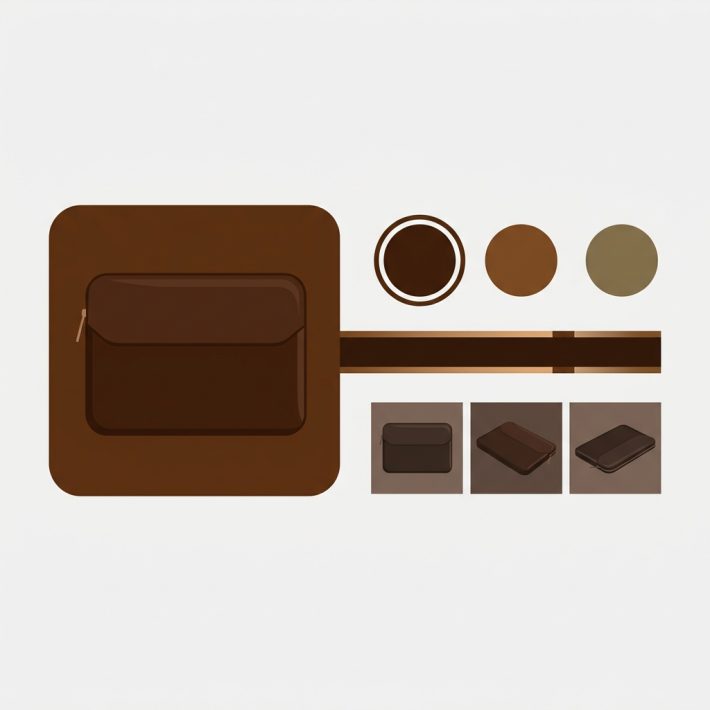
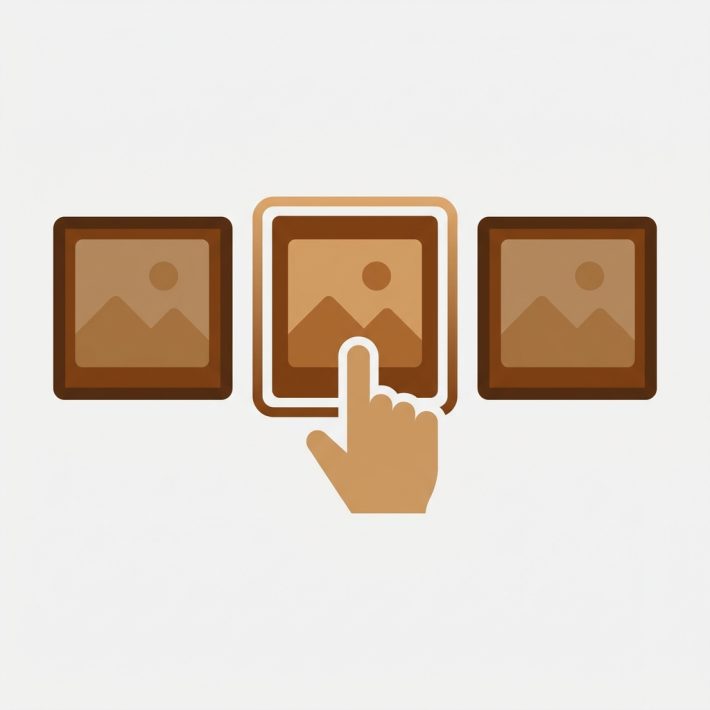
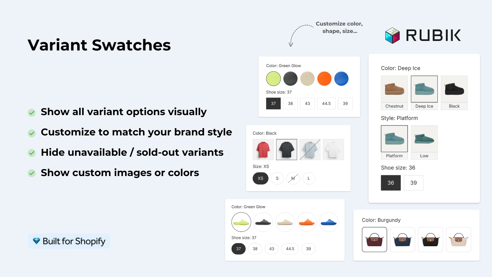
Shopify product card swatches are small clickable color or image chips rendered on a product card in any listing view: collection pages, search results, featured product rows, the homepage. Each chip represents a variant of that product. Tap one and the card updates to show that variant. No click-through required to see what colors exist.
The product page version of this has been around in Rubik Variant Images from day one: pick a color on the product page, the gallery filters to that color’s photos. Product card swatches take the same idea and push it one level up, to the grid where shoppers actually browse. That’s the part that was missing. Shoppers make a lot of decisions in the grid before they ever open a product.
Why does this matter so much? Because the collection page is where most browsing happens. If a shopper can’t tell a product comes in their color without opening it, a chunk of them just won’t bother. Showing colors up front is one of the cleaner conversion wins in Shopify merchandising, and it’s exactly what good collection page color swatches are for.
How product card swatches work in Rubik Variant Images
Click a swatch on a product card and the card swaps its image to that variant. It can also update the card’s price and the add-to-cart link, so a shopper can add the right color straight from the grid. Hovering a swatch previews that variant’s image without committing to the switch. All of it is configurable.
Here’s the behavior, broken down:
- Image swap. Clicking a swatch replaces the card’s featured image with the selected variant’s image.
- Price update. The card price can update to match the selected variant (configurable, in case your colors are all priced the same).
- Add-to-cart link. The add-to-cart action can point at the chosen variant, so the right color goes in the cart.
- Hover preview. Hovering a swatch shows that variant’s image as a preview. Desktop nicety, optional.
- Desktop and mobile. Desktop click-to-switch and mobile tap-to-switch are both on by default.
By default, cards show only the first variant option (usually Color), and the swatches render smaller than they do on the product page. That’s deliberate. Cards are small. Cramming size and material chips onto a grid tile turns it into noise. Keep the grid clean, save the full option set for the product page. You can change the default if your catalog really needs it, but we’d push back on doing that without a reason.
And the whole thing is metafield-based with no external API calls. The swatch data loads with the page itself. No third server in the middle, nothing phoning home while a shopper waits.
How to enable product card swatches
Product card swatches are off by default, so you opt in. Open Rubik Variant Images, go to the Swatch settings page, and turn on the toggle labeled Enable on product cards. That’s the switch. Once it’s on, swatches start rendering on your collection and search listings for products that have variant media assigned.
The short version:
- Open Rubik Variant Images in your Shopify admin.
- Go to Swatch settings.
- Turn on Enable on product cards.
- Open a collection page on your storefront and check the cards.
If you haven’t assigned variant images yet, do that first, otherwise the swatches have nothing to show. You can assign manually by drag-and-drop, or let the app do the work. The AI auto-assign feature handles one product at a time by reading the product title, option values, image filenames, and alt text. For big catalogs, bulk assign groups images by gallery order across hundreds of products in the background. (Quick note: bulk assign is image-order based, not filename matching. People mix that up.)
Why ship it disabled by default? Because we’d rather you turn it on knowing it’s there than have swatches appear on your live grid unannounced after an update. Surprises on a storefront are bad. Opt-in is the right call.
Styling swatches on the Product Card tab
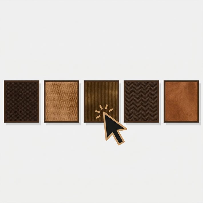
Styling for product card swatches lives in its own place: open Swatch style and pick the Product Card tab. It’s separate from the product page styling on purpose, because the right swatch size for a full product page is too big for a cramped grid tile. Set shape, size, spacing, and borders for the card context without touching how the product page looks.
You get the same shape options the rest of the app uses: circle, square, rounded square, and pill. Match them to your brand. If you’re torn between rounds and rectangles, we wrote up the tradeoffs in button swatches vs circle swatches. The styling is CSS-isolated through Shadow DOM, so your theme’s CSS won’t fight the swatches and the swatches won’t bleed into your theme.
My honest take? Keep card swatches smaller and simpler than your product page ones. The grid is for scanning, not configuring. A row of tidy color dots reads instantly. Oversized chips with thick borders just fight the product photo for attention. Less is more here.
“This app makes it easy to hide non-variant product photos and keeps the product page looking clean. It also helps to show clean custom swatches. Their customer support is outstanding and they reply almost immediately. They were able to fix a bug for me with minimal weight time.”
Anonymous merchant, 2026-02-18, Rubik Variant Images on the Shopify App Store
Product card swatches vs combined listings
Product card swatches show the variants of one product on its card. Combined listings show separate products grouped together. That’s the whole distinction, and it decides which tool you need. If navy, olive, and rust are variants inside a single product, you want product card swatches in Rubik Variant Images. If each color is its own product with its own URL, you want combined listings.
Why would colors be separate products? Usually SEO. A separate product per color means a unique URL, title, and image set per color, which can rank on their own. It also sidesteps Shopify’s variant ceiling for catalogs that blow past it. That’s the job of Rubik Combined Listings, which lives on a separate site because it solves a separate problem.
| Question | Rubik Variant Images (product card swatches) | Rubik Combined Listings |
|---|---|---|
| What gets grouped? | Variants of one product | Separate products |
| One URL or many? | One product URL | A URL per product (better SEO) |
| Where do swatches show? | Product cards plus product page | Collection pages plus product pages |
| Variant ceiling concern? | Within Shopify’s per-product limits | Bypasses the limit (each color is its own product) |
| Pricing starts at | Free, then $25/mo for 100 products | Free, then $10/mo for 100 groups |
Plenty of stores run both. Use combined listings to group your separate color products with swatches on the collection grid, then use Rubik Variant Images to filter the gallery once a shopper lands on a product page. Each app owns its half. If you’re weighing the collection-grid side specifically, this guide to collection page swatches on the Horizon theme walks through it on craftshift.com.
Themes, speed, and what to expect
Product card swatches work natively on 177+ themes, including Dawn and Horizon, with no custom code on your end. The app maps to each theme’s card markup so swatches drop into the right place in the grid. If you run a heavily customized or fully custom theme, support can map it for you.
A few things worth setting expectations on. The card always reflects whatever you assigned in the app, so messy variant media gives you messy cards. Clean assignment first, then enable card swatches. If your Dawn theme variant images already look right on the product page, you’re most of the way there. And if something refuses to render, our color swatches not working guide covers the usual culprits before you reach out.
Performance? Metafield-based, no external API calls. The swatch data ships with the page, so adding swatches to a grid of 40 cards doesn’t add 40 network round-trips. That part we care about a lot. A collection page that loads slow loses shoppers no matter how nice the swatches look.
See product card swatches running on the live demo store, watch the tutorial video, or read the getting started guide. Comparing colors-as-separate-products? Check the combined listings demo and its docs too.
Frequently asked questions
Does Rubik Variant Images now work on collection pages?
Yes. As of the product card swatches feature (live May 26, 2026), Rubik Variant Images renders variant swatches on product cards across collection pages, search results, and other listing pages. The older claim that it only works on the product page is now outdated.
How do I enable product card swatches?
Open the app, go to the Swatch settings page, and turn on the Enable on product cards toggle. It’s off by default, so you opt in. Make sure your products already have variant images assigned, or the swatches will have nothing to display.
Can I style card swatches separately from product page swatches?
Yes. Open Swatch style and use the Product Card tab. It’s a separate set of controls, so you can keep card swatches small and tidy for the grid while leaving your product page swatches at full size. Shapes include circle, square, rounded square, and pill.
What’s the difference between product card swatches and combined listings?
Product card swatches show the variants of one product on its card. Combined listings group separate products (each color its own product and URL) and show swatches across them. Use Rubik Variant Images when colors are variants, and Rubik Combined Listings when each color is a separate product.
Which themes support product card swatches?
Product card swatches work natively on 177+ themes, including Dawn and Horizon, with no custom code. If you run a custom theme, support can map it so the swatches render in the right spot on your cards. It all loads metafield-based, with no external API calls.
Related reading