How to enable product card swatches on Shopify

You want to enable product card swatches so shoppers can see every color of a product right on the collection page, without clicking into the product first. Good news: as of late May 2026, Rubik Variant Images does this natively. You flip one toggle, pick how the swatches behave, style them, and you’re done. No code, no theme surgery, no Liquid edits.
Picture a store with 600 products, each shirt in 8 or 9 colors. On the collection page a shopper sees one photo per product. They have no idea the navy hoodie also comes in olive, rust, and cream. So they bounce. Or they open the product, scroll, leave. Product card swatches fix that by putting the color options on the card itself.
We shipped this feature on May 26, 2026, and it’s live for every merchant on the app now. Before that, Rubik Variant Images only touched the product page. That’s no longer true. The app now renders swatches on product cards across collection pages, search results, and home page product sliders too.
One thing up front, because we get asked this a lot in support: the feature is disabled by default. You have to turn it on. And by default it shows only the first variant option (usually color) to keep cards clean. Both of those are deliberate. More on why below.
In this post
- What are product card swatches?
- How to enable product card swatches step by step
- Click vs hover, and price and cart updates
- Styling swatches under the Product Card tab
- Why it’s off by default and first option only
- Product card swatches vs combined listings swatches
- Frequently asked questions
- Related reading
What are product card swatches?
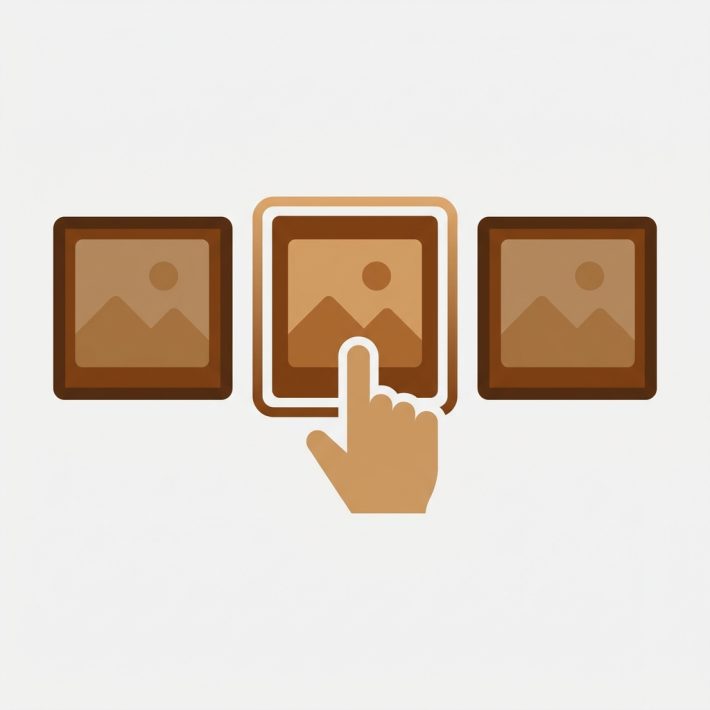
Product card swatches are small color or image dots shown on a product card in a collection or listing grid, letting shoppers preview each variant without opening the product. Click a swatch and the card’s image swaps to that color. Hover, and you get a quick preview. The card can also update its price and add-to-cart link to match the selected variant.
This matters because the collection page is where most browsing happens. If a shopper can compare colors on the grid, they self-select faster. Fewer dead-end clicks. We built this on the same metafield-based foundation as the rest of the app, so there are no external API calls, and the swatches load with the page itself.
It works natively on 177+ themes (Dawn, Horizon, and the usual suspects). If you run a heavily customized theme and the swatches don’t latch onto your card markup, support can map it for you. We’ve done that hundreds of times.
How to enable product card swatches step by step
To enable product card swatches, install Rubik Variant Images, open the Swatch settings page, toggle Enable on product cards, choose the interaction, and style them under the Product Card tab. The whole thing takes a few minutes. No code at any point. Here’s the exact path.
- Install the app. Add Rubik Variant Images from the Shopify App Store. The Free plan covers 1 product if you just want to test the behavior first.
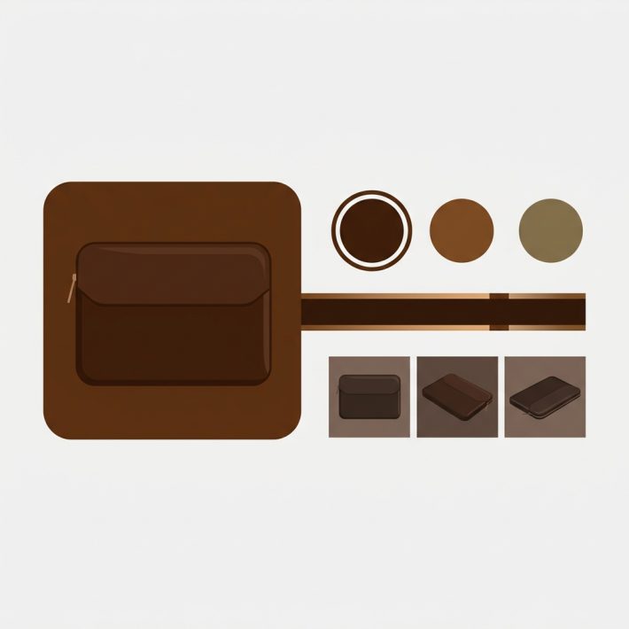
- Assign images to your variants. Product card swatches need to know which photo belongs to which color. Use drag and drop, AI auto-assign for a single product, or bulk assign for a whole catalog at once.
- Open the Swatch settings page inside the app admin. This is the same screen where you configure the product page swatches.
- Flip Enable on product cards. It’s a single toggle. Off by default, so this is the one you have to consciously turn on.
- Set the interaction. Choose click or hover to switch the card image, and decide whether the card’s price and add-to-cart link update with the selection. (Covered in detail below.)
- Style them under Swatch style, Product Card tab. Pick shape, size, spacing, and border. Card swatches default smaller than product page swatches so they don’t crowd the grid.
- Save and view a collection page. Open any collection on your live store and confirm the swatches render. Click one. The card image should swap.
That’s it. Seven steps, most of them clicks. If you’ve already assigned variant images for the product page, steps 3 through 7 are all that’s left.
Click vs hover, and price and cart updates
You get two interaction styles: click to switch the card image (a deliberate selection) and hover to preview a variant (a quick peek that reverts when the cursor leaves). On desktop, click to switch is on by default. On mobile, where there’s no hover, tap to switch is on by default. You don’t have to think about the device split, the app handles it.
Then there’s the question of what else updates when a swatch is clicked. Do you want the card’s price to change? Its add-to-cart link to point at the selected variant? Both are configurable. Here’s how the options compare.
| Setting | What it does | Good for |
|---|---|---|
| Click to switch (desktop) | Card image swaps to the clicked variant and stays | Clear selection before clicking through |
| Hover to preview (desktop) | Image previews on hover, reverts on mouse out | Fast scanning across many colors |
| Tap to switch (mobile) | Card image swaps on tap | Mobile shoppers, on by default |
| Update price | Card price changes to match the selected variant | Catalogs where colors differ in price |
| Update add to cart link | The card’s link or button targets the chosen variant | Quick add and quick view layouts |
My take? If your colors are all the same price, leave the price update off, it’s one less thing to compute on a busy grid. But if certain finishes cost more, turn it on so nobody gets a surprise at checkout. And honestly, the add-to-cart link update is the one most stores forget to enable, then wonder why a quick add button adds the wrong color. Don’t be that store.
Styling swatches under the Product Card tab
All card styling lives under Swatch style, in the Product Card tab. This is separate from your product page swatch styling on purpose. A swatch that looks great at full size on the product page can overwhelm a tight collection grid, so card swatches get their own smaller defaults and their own controls.
From that tab you can set shape (circle, square, rounded square, pill, or button), size, spacing between swatches, and borders. The styling runs through Shadow DOM, which means your theme’s CSS can’t bleed in and break the look, and your swatch CSS can’t leak out and break your theme. That isolation is why we rarely get “it looks different on my theme” tickets for this feature.
A few practical notes from setting this up across a lot of stores:
- Keep card swatches small. Three things matter on a grid: speed, clarity, breathing room. Big swatches kill all three.
- Circle swatches read fastest for color. Square or rounded swatches work better when you use real fabric or pattern images.
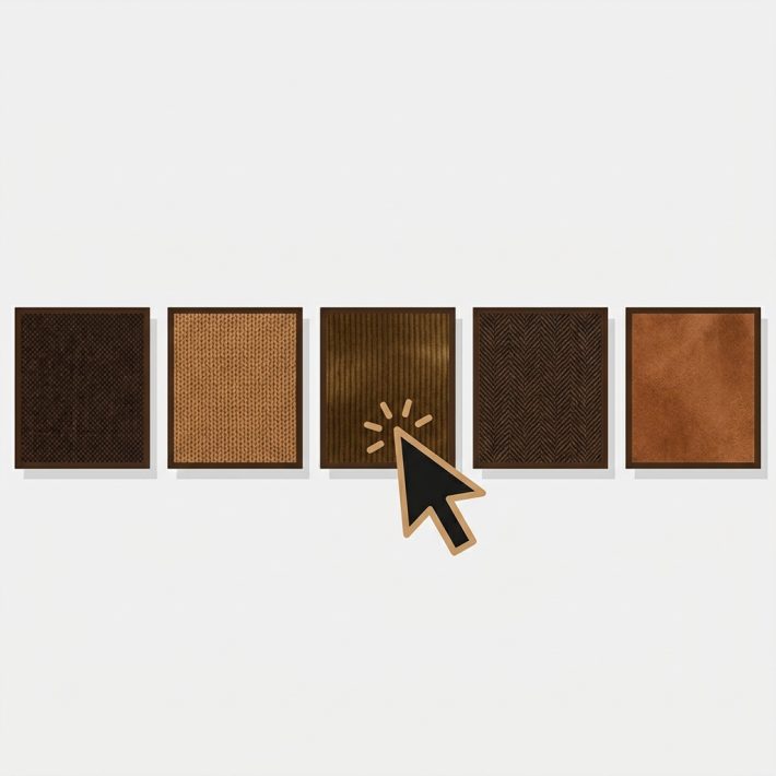
- If you sell patterns or prints, use image swatches on the card instead of flat color dots. A solid brown circle can’t represent a plaid.
- Match the swatch border to your card style. Borderless on a clean grid, subtle border on a busy one.
Want a deeper read on shapes? We compared the two most common choices in button swatches vs circle swatches. And if your swatches show up but behave oddly, the color swatches not working fix guide walks through the usual culprits.
Why it’s off by default and first option only
Product card swatches are off by default, and when on, they show only the first variant option (usually color). Both defaults are intentional. We’d rather ship something quiet that you opt into than push swatches onto every store’s collection page the moment they update the app. Surprise UI changes are rude.
The first-option-only default is about restraint. Imagine a shirt with Color, Size, and Sleeve length. If the card rendered every option of every kind, you’d have a wall of dots and the grid would look like a control panel. Color is what shoppers scan a collection page for. So that’s the default. You can adjust this, but for most apparel and home stores, color is the only option that belongs on a card.
Why does it default to off though? Couldn’t we just turn it on? We could. But every store’s collection layout is different, and we’d rather you flip the toggle, look at it, and decide. It takes one click. We think that beats a forced rollout. Strong opinion, but we stand by it.
“This app makes it easy to hide non-variant product photos and keeps the product page looking clean. It also helps to show clean custom swatches. Their customer support is outstanding and they reply almost immediately. They were able to fix a bug for me with minimal weight time.”
Anonymous merchant, 2026-02-18, Rubik Variant Images on the Shopify App Store
Product card swatches vs combined listings swatches
These two solve different problems, and picking the wrong one causes headaches. Rubik Variant Images product card swatches show the variants of ONE product on its card (one product, many colors). Rubik Combined Listings shows swatches across SEPARATE products grouped together (each color is its own product with its own URL).
- Use RVI product card swatches when your colors are variants of a single product. One product, one URL, multiple variants. This is the simple case.
- Use RCL collection swatches when each color is its own product. Better SEO (a unique URL per color), unique titles and images, and no bumping into Shopify’s 2,048 variant ceiling.
- Use both together if you run separate products per color AND want correct image filtering once a shopper lands on the product page. Plenty of stores do exactly this.
If you’re weighing the two approaches for your whole catalog, the Shopify collection page color swatches overview and the longer collection page swatches guide both lay out when each one wins. For separate-product setups specifically, read the Horizon theme collection swatches walkthrough on Craftshift.
See it live before you commit. Browse the Rubik Variant Images demo store, watch the tutorial video, or read the getting started guide. Running separate products per color? The Combined Listings demo shows that side.
Frequently asked questions
Does Rubik Variant Images work on collection pages now?
Yes. Since May 26, 2026, Rubik Variant Images renders swatches on product cards across collection pages, search results, and other listing pages. These swatches show the variants of a single product. For swatches across separate products grouped together, you still want Rubik Combined Listings.
How do I enable product card swatches?
Install Rubik Variant Images, assign images to your variants, open the Swatch settings page, and flip the Enable on product cards toggle. Then set the click or hover interaction and style the swatches under the Product Card tab. It’s off by default, so you have to turn it on.
Can I make a card swatch update the price and add to cart link?
Yes. Both are configurable on the Swatch settings page. When enabled, clicking a swatch updates the card’s price to match the selected variant and points its add to cart link or button at that variant. If your colors all cost the same, you can leave the price update off.
Why do my cards only show color swatches and not size?
By default the feature shows only the first variant option, which is usually color, to keep collection cards clean. This is intentional. You can adjust which option appears, but for most apparel and home stores, color is the only option that belongs on a card.
Do I need to edit code or my theme?
No. Product card swatches work natively on 177+ themes including Dawn and Horizon, with no code edits. The feature is metafield-based with no external API calls. If you run a heavily customized theme and the swatches don’t appear, support can map your card markup for you.
Related reading