Button vs circle vs dropdown: variant selectors
Not every variant option works the same way. Color is visual. Size is text. A custom engraving field might have 50 possible values. Each one needs a different selector to give customers the fastest way to pick what they want.
Shopify’s default variant selector is a dropdown for everything. That works, but it hides options behind a click and treats every option identically. With Rubik Variant Images, you can assign a different selector type to each option: circle swatches for Color, Shopify button swatches for Size, and a dropdown for long lists.
In this post
- Circle swatches: when and why
- Button and pill swatches: when and why
- Dropdown selectors: when and why
- Mixed types on the same product
- Rubik presets for each type
- Decision guide
- Video walkthrough
- Frequently asked questions
- Related reading
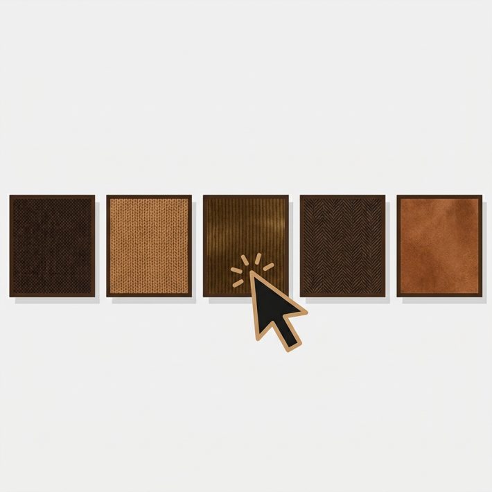
Circle swatches: when and why
Circle swatches are the standard for color options across e-commerce. A row of colored circles tells shoppers “these are your color choices” without needing any label. Customers recognize the pattern instantly.
Visual and immediate. A red circle communicates faster than the word “Red” in a dropdown. Customers scan colors in a fraction of a second. Circles are also compact. You can fit 8 to 12 color options in a single row without scrolling.
Solid colors and image-based colors. For simple colors like Red, Blue, or Black, fill each circle with the matching hex value. For patterns, textures, or multi-tone colors like “Ocean Mist,” fill circles with a product image or fabric swatch photo. The circle crops to the center, giving customers a visual preview. Learn more in the image swatches vs color swatches comparison.
When NOT to use circles. Circles lose their advantage when the option is not visual. Putting “S,” “M,” “L,” and “XL” inside small circles is hard to read and wastes the shape. If the values are text-based, buttons or pills do a better job. For more on shapes, see the swatch shapes guide.
Button and pill swatches: when and why
Button swatches (also called pill swatches) are rectangular or pill-shaped elements that display the option value as text. They look like small clickable buttons, and customers treat them that way.
Text is the content. The label is the swatch. “Medium,” “Cotton,” “32×30” are all immediately readable inside a button. No tooltip or hover needed. Buttons also expand to fit their content naturally, so “S” is narrow and “Extra Large” is wide.
Size, material, and style options. S, M, L, XL. Cotton, Polyester, Silk. Matte, Glossy, Brushed. These are all text values that need to be read, not seen as colors. Shopify button swatches are the natural fit.
Some Rubik presets combine button layout with images and prices. Preset #9 (Square button with image and price) shows a product thumbnail alongside the variant price inside each button, which helps when variants have different price points.
When NOT to use buttons. Buttons fall short for color options. A button labeled “Ocean Mist” tells you nothing about what that color looks like. Customers end up clicking each one just to see the product image change. Use circle swatches or image swatches for colors instead. For more on why visual selectors beat text for color variants, see this swatches vs dropdowns comparison on CraftShift.
Dropdown selectors: when and why
Dropdowns hide all options behind a click, showing only the selected value until the customer opens the menu. This makes them the most space-efficient selector, but also the least visual.
Best for long lists. A dropdown takes up one line regardless of how many options it contains. If your product has 50 or more values for a single option, swatches create visual clutter. A dropdown keeps things manageable. Same goes for non-visual options like measurement ranges or technical specifications.
When NOT to use dropdowns. For color options, dropdowns mean an extra click before the customer sees what is available. If your option has fewer than 10 to 15 values and the values are visual or short text, swatches or buttons are almost always better.
Mixed types on the same product
A t-shirt with Color and Size should not use the same selector for both. Color needs to be visual. Size needs to be readable. Forcing both into circles or both into dropdowns means one will always feel wrong.
Rubik lets you assign a different selector type to each option on the same product. Image swatches for Color, buttons for Size, a dropdown for custom engraving text. Each option gets the treatment that fits its content. This is one of the biggest advantages over Shopify’s native selectors, which apply the same format to every option.
For a step-by-step walkthrough, see how to show different swatch types for different options.
Rubik presets for each type
Rubik Variant Images ships with 11 product page style presets. Here are the ones most relevant to this comparison.
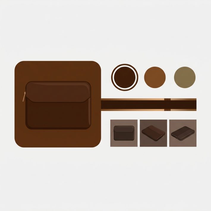
Circle presets. Preset #3 (Circle swatches) is the classic round color swatch, clean and universally recognized. Preset #7 (Small circle swatches, one row) arranges compact circles in a single horizontal line for products with a few color options.
Button presets. Preset #9 (Square button with image and price) shows a product thumbnail and variant price inside each button. Preset #10 (Square buttons) uses clean text-based buttons without images, good for size grids.
Pill presets. Preset #6 (Pills with images) uses pill-shaped swatches with a small image alongside the text label. A hybrid approach for when you need both visual preview and readable text.
Preview all presets on the demo store. Each preset is a starting point that you can customize through CSS variables.
Decision guide
Use this table to pick the right selector type for each option on your product.
| Option type | Recommended selector | Why |
|---|---|---|
| Color (solid) | Circle swatches | Visual, compact, instantly scannable |
| Color (patterns/textures) | Circle or square image swatches | Shows the actual pattern inside the swatch |
| Size (S/M/L/XL) | Button or pill swatches | Text is the content, needs to be readable |
| Material (Cotton, Silk) | Button swatches | Descriptive labels, no visual equivalent |
| Style or finish | Button swatches | Text communicates the difference |
| Long list (50+ values) | Dropdown | Keeps the page clean and scrollable |
| Measurement or dimension | Dropdown or buttons | Depends on the number of values |
| Custom engraving text | Dropdown | Too many values for swatches |
If you are unsure, start with circles for anything color-related and buttons for everything else. You can always switch later without losing configuration. For a complete walkthrough on adding swatches, see how to add color swatches to Shopify.
Video walkthrough
See how to configure different variant selector types in Rubik:
Frequently asked questions
Should I use buttons or circles for Shopify variant swatches?
Use circles for color options where the visual preview matters. Use buttons for text-based options like Size, Material, or Style where customers need to read the label. Most stores benefit from using both on the same product.
Can I use different selector types for different options on one product?
Yes. Rubik Variant Images lets you assign a different swatch type to each option. Image swatches for Color, pill buttons for Size, and a dropdown for a third option, all on the same product page. See how to configure mixed swatch types for details.
When should I keep the dropdown instead of using swatches?
Dropdowns work best when you have 50 or more option values, when the option is non-visual and non-scannable, or when space is extremely limited. For most color and size options with fewer than 15 values, swatches or buttons perform better.
Can I switch selector types without losing my setup?
Yes. Changing the selector type in Rubik does not affect your variant images, color assignments, or other configuration. You can switch from circles to buttons and back at any time. The swatch type controls display, not storage.
Related reading
- How to show different swatch types for different options
- Shopify swatch shapes: circles, squares, and pills
- How to add color swatches to Shopify
- Image swatches vs color swatches on Shopify
- CSS customization ideas for Shopify variant swatches
- Rubik Variant Images FAQ
- Swatches or dropdowns? What the data says (CraftShift)
- The complete guide to Shopify color swatches (CraftShift)