Shopify swatch design: shapes, sizes, colors
Swatches are the first thing customers interact with on a product page. Before they read the description, before they check the price, they scan the color options. The shape, size, and style of your swatches affect how quickly people understand what is available and how confident they feel clicking “Add to Cart.”
Bad swatch design makes products look cheap. Tiny swatches that are hard to tap on mobile frustrate shoppers. Colors that do not match the actual product create distrust. Getting the design right is one of the highest-impact, lowest-effort improvements you can make to your product pages.
This guide covers swatch shapes, sizing for desktop and mobile, color selection, image swatches versus color swatches, and practical design tips that work across Shopify themes.
In this post
- Swatch shapes: circle, square, and pill
- Sizing for desktop and mobile
- Choosing the right swatch colors
- Image swatches vs. color swatches
- Text and button swatches
- Mixing swatch types per option
- Borders and selection indicators
- Tooltips and labels
- Setting up swatches with Rubik Variant Images
- Video walkthrough
- Frequently asked questions
- Related reading
Swatch shapes: circle, square, and pill
The three most common swatch shapes are circles, squares (with optional rounded corners), and pills (elongated rectangles). Each has strengths depending on what you sell and how your store looks.
Circles
Circles are the most popular swatch shape for color options. They feel natural for representing color because they mimic how we think about color samples – paint swatches, cosmetic dots, fabric circles. Circles work best when your variants are solid colors or simple patterns.
The downside of circles is limited display area. A 30px circle shows less of a pattern or texture than a 30px square. For image-based swatches showing fabric textures or product thumbnails, circles crop the corners and reduce the visible area by about 21%. For a deeper comparison, see our button swatches vs. circle swatches guide.
Squares
Squares show more content per pixel. A 30px square has 900 square pixels of visible area compared to a circle’s ~707. This makes squares better for image swatches where you want to show product thumbnails, fabric textures, or detailed patterns. Slightly rounded corners (2-4px border radius) soften the look without losing display area.
Squares also align more neatly in grids. When you have many variants – 10+ colors, for example – a grid of squares looks orderly. Circles in a grid leave diagonal gaps that can look uneven, especially at smaller sizes.
Pills
Pill-shaped swatches are elongated rectangles with fully rounded ends. They are ideal for text-based options like sizes (S, M, L, XL) or named options (“Matte,” “Glossy”). Pills give text room to breathe. They also work well for long color names that would look cramped inside a circle or square.
Many stores use pills for non-visual options (size, material, finish) and circles or squares for color. This mixed approach gives customers an instant visual cue about which options are colors and which are not. Read the swatch shapes guide for more details on choosing the right shape for each option type.
Sizing for desktop and mobile
Size matters more than most merchants think. Swatches that are too small are hard to see and impossible to tap accurately on mobile. Swatches that are too large dominate the product page and push important content below the fold.
Desktop sizing
For desktop, swatches between 28px and 40px work well. 32-36px is the sweet spot for most stores. At this size, colors are clearly distinguishable, image swatches show enough detail, and the swatches do not overwhelm the variant selector area. If your product has many variants (15+), lean toward the smaller end. Fewer variants allow for larger swatches.
Mobile sizing
Mobile is where swatch sizing gets tricky. Apple’s Human Interface Guidelines recommend a minimum tap target of 44×44 points. Google’s Material Design suggests 48x48dp. If your swatches are 28px, they are below both thresholds. Customers will mis-tap, select the wrong variant, and get frustrated.
For mobile, aim for at least 36px swatches with 8px gap between them. The total tap target (swatch + surrounding padding) should reach 44px minimum. Some stores increase swatch size on mobile to 40-44px while keeping desktop at 32px. This is the approach Rubik Variant Images takes – separate size controls for mobile and desktop.
Spacing between swatches
Gap between swatches affects both appearance and usability. Too tight (2-4px) and swatches blur together, making it hard to distinguish colors and causing tap errors on mobile. Too wide (12px+) and the swatch row takes up too much horizontal space, causing wrapping. A gap of 6-8px between swatches balances visual clarity with space efficiency.
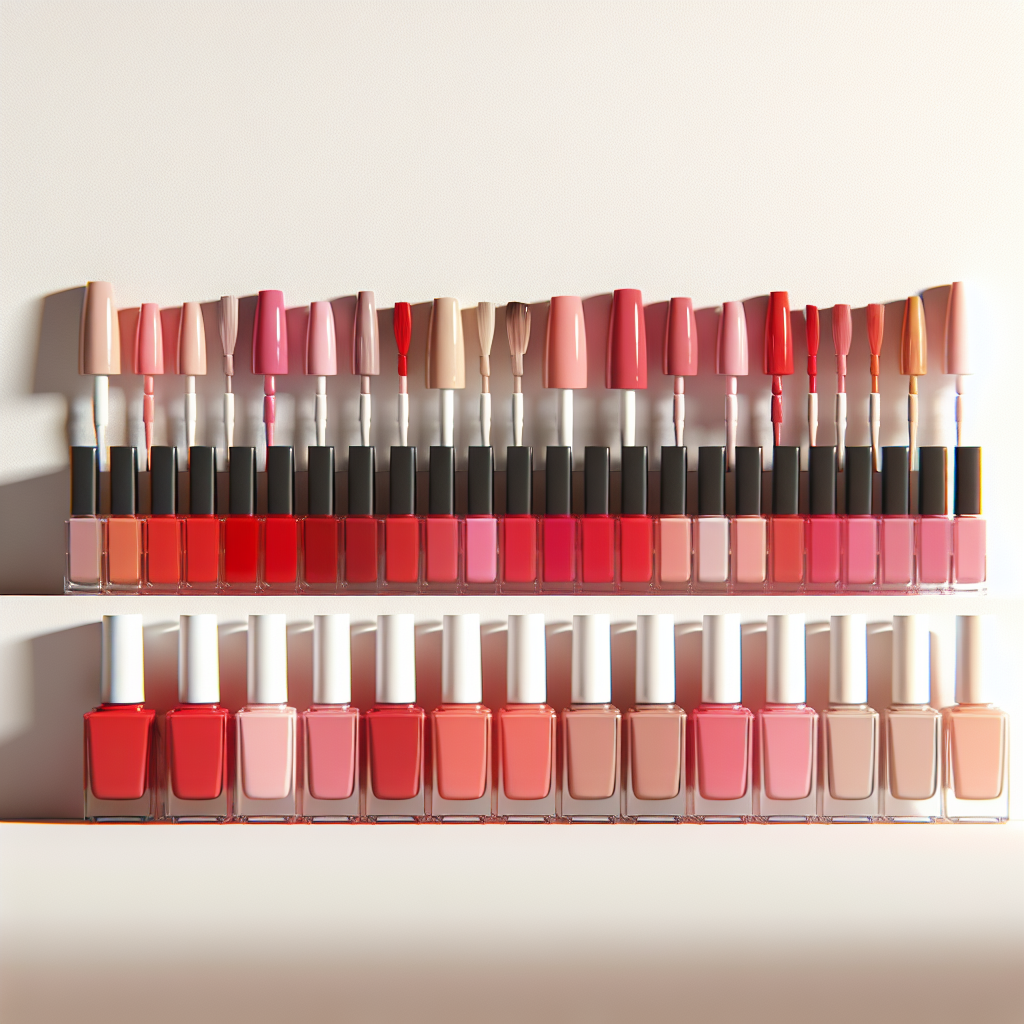
Choosing the right swatch colors
This sounds simple. The swatch color should match the product color. In practice, it is surprisingly hard to get right.
Match the product, not the name
If your variant is called “Ocean Mist,” the swatch color should match what the actual product looks like – not what you imagine “Ocean Mist” should be. Take a color sample from your product photo. Use a color picker tool to extract the hex code from the product image itself. The Color Palette Generator can help you extract accurate colors from your product photos.
Account for screen differences
Colors look different on every screen. An iPhone display shows colors differently than a budget Android phone or a laptop monitor. You cannot control this, but you can minimize the gap by using the midtone of your product color rather than a bright or saturated version. Slightly desaturated swatch colors tend to look more accurate across devices.
Handle similar colors carefully
If you sell a product in “Navy,” “Midnight Blue,” and “Dark Slate,” the swatches may look nearly identical at small sizes. When colors are very close together, consider using image swatches instead of solid colors. A product thumbnail makes the difference immediately obvious in a way that two similar blue circles cannot. For more on this, see our image swatches vs. color swatches comparison.
White and light colors need borders
A white swatch on a white background is invisible. Any light-colored swatch (white, cream, ivory, light gray) needs a visible border to distinguish it from the page background. A thin 1px border in light gray (#E0E0E0 or similar) solves this without looking heavy. Rubik Variant Images applies this border automatically for light-colored swatches.
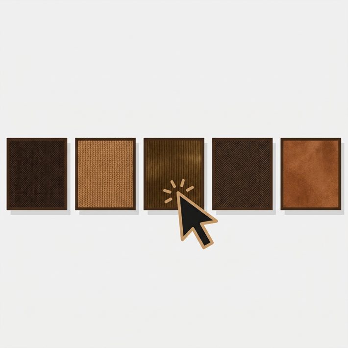
Image swatches vs. color swatches
Color swatches are solid circles or squares filled with a single hex color. Image swatches use a product photo or texture as the swatch background. Which should you use?
When to use color swatches
Use solid color swatches when your variants are distinct, easily distinguishable colors. A t-shirt in Red, Blue, Green, and Yellow works perfectly with color swatches. The colors are different enough that a small solid circle communicates the option instantly.
When to use image swatches
Use image swatches when color alone does not tell the full story. Patterns (plaid, floral, camo), textures (leather, knit, linen), prints (graphic tees, custom designs), and multi-color variants all need image swatches. An image swatch showing the actual fabric pattern gives customers far more information than a solid color that roughly approximates the pattern’s dominant hue.
Image swatches also help when you have many similar colors. Five shades of blue as solid color circles look almost identical. Five product thumbnail swatches show clearly different products. The Swatch Preview tool lets you experiment with both approaches before committing.
Text and button swatches
Not every variant option needs a visual swatch. Sizes, materials, quantities, and other non-visual options work better as text buttons or pills. Showing a blue circle for “Size: Large” makes no sense. A pill button that says “L” or “Large” is immediately clear.
Text swatches should use readable font sizes (at least 12px, ideally 14px), have enough padding inside the button (8-12px horizontal), and clearly indicate the selected state. The selected text swatch should have a different background, border, or text color that makes it obvious which option is active.
Mixing swatch types per option
The best-designed stores mix swatch types based on the option. Color gets image or color circle swatches. Size gets text pills. Material gets texture image swatches. This approach gives each option the most appropriate visual treatment.
Rubik Variant Images supports this out of the box. You configure swatch type per option – image swatches for Color, text pills for Size, color circles for Finish – all on the same product page. See the mixed swatch types guide for setup instructions.
Borders and selection indicators
Customers need to know which swatch is currently selected. The selection indicator should be immediately obvious without requiring a second look.
Common selection styles include a thicker border (2-3px solid border in a contrasting color), a ring or outline offset from the swatch by 2-3px, a checkmark overlay, or a scale effect where the selected swatch is slightly larger. The border or ring approach is the most accessible because it does not rely on color alone to indicate selection.
Avoid using only a color change for selection. A blue swatch with a blue selection border is invisible. The selection indicator must contrast with every possible swatch color. A black border works for most colors, but fails on dark swatches. A dual-border approach (white inner ring + dark outer ring) works universally. For CSS customization ideas, see our swatch CSS guide.
Tooltips and labels
A color swatch alone does not tell customers the color name. Is that dark green “Forest,” “Hunter,” or “Emerald”? Tooltips solve this. When a customer hovers over (desktop) or taps (mobile) a swatch, a small label appears showing the variant name.
Tooltips should appear quickly (under 200ms delay), be positioned above or below the swatch without covering other swatches, use a readable font size, and disappear when the cursor moves away. The swatch tooltip guide covers implementation details and best practices for tooltip design.
An alternative to tooltips is an inline label that updates dynamically. Instead of a tooltip popup, the selected variant name appears in text next to or below the swatch row: “Color: Forest Green.” This is more accessible than tooltips because it does not require hover interaction.
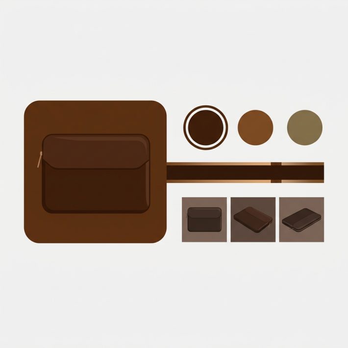
Setting up swatches with Rubik Variant Images
Rubik Variant Images gives you full control over swatch design on your product pages. You can configure shape (circle, square, rounded square), size (separate values for desktop and mobile), border style, selection indicator, and tooltip behavior – all from the app dashboard without writing code.
The app supports all three swatch types – color, image, and text – and lets you assign different types to different options on the same product. Data is stored in Shopify metafields with metafield-based loading and no external API calls, so swatches render instantly with no performance penalty.
Pricing is Free ($0) for 1 product, Starter ($25/month) for up to 100 products, Advanced ($50/month) for up to 1,000 products, and Premium ($75/month) for unlimited products.
Note that Rubik Variant Images provides swatches on product pages only. If you need swatches on collection pages to let customers switch colors without opening the product page, Rubik Combined Listings is built for that use case.
Video walkthrough
Watch how to set up custom swatches in Rubik Variant Images:
Frequently asked questions
What is the best swatch shape for Shopify?
Circles work best for solid color options. Squares or rounded squares are better for image swatches and patterns because they show more detail. Pills work best for text-based options like sizes. Many stores mix shapes based on the option type.
How big should Shopify swatches be on mobile?
At least 36px, with enough padding to reach a 44px tap target. Apple and Google both recommend minimum 44-48px tap targets for touch interfaces. Swatches smaller than 36px cause frequent mis-taps on mobile devices.
Should I use image swatches or color swatches?
Use color swatches for distinct solid colors. Use image swatches for patterns, textures, prints, or when you have many similar colors that are hard to distinguish as solid circles. Image swatches give more information but require more setup work.
How do I make sure my swatch colors match my product?
Use a color picker to extract the hex code directly from your product photo rather than guessing. The Color Palette Generator can extract accurate colors from product images. Use midtone values rather than the brightest or most saturated version of the color.
Can I use different swatch types for different options?
Yes. Rubik Variant Images lets you assign different swatch types per option. For example, you can show image swatches for Color, text pills for Size, and color circles for Finish – all on the same product page. See the mixed swatch types guide for details.
Do swatches work on Shopify collection pages?
Rubik Variant Images provides swatches on product pages only. For collection page swatches, Rubik Combined Listings is purpose-built for that. It displays variant swatches directly on collection pages so customers can switch colors without opening each product.
How do I handle sold-out variant swatches?
You can either hide sold-out swatches entirely or show them with a visual indicator like reduced opacity, a strikethrough line, or a crossed-out style. Hiding reduces clutter but can confuse returning customers who remember seeing a color option. A visual indicator is usually the better approach. See our sold-out swatch guide for setup options.
Related reading