Do product card swatches increase Shopify conversions?

The honest answer to the product card swatches conversions question is: probably yes, for the right store, for reasons that have nothing to do with magic. Swatches on a product card let a shopper see every color a product comes in without opening the page. Fewer clicks. Faster discovery. Less back-and-forth. That’s the whole pitch, and it’s a good one.
But we should be careful here. Anyone who tells you a swatch row adds a flat percentage to your conversion rate is guessing (or selling you something). We built the product card swatch feature inside Rubik Variant Images, and we shipped it because the reasoning holds up, not because we ran some lab study that proves a number. There isn’t one. So let’s talk about the actual mechanics instead.
Picture a store with 200 products, each in 8 colors. On a standard collection page, a shopper sees one photo per product. The grey hoodie. They have no idea the same hoodie also comes in forest green, which is the color they actually wanted. They scroll past. That’s a lost sale that never even registered as a click.
And that gap, the one between what you sell and what the shopper sees, is exactly where product card swatches earn their keep. Do they always work? No. Do they help in more cases than they hurt? In our experience building this, yes.
In this post
- What are product card swatches?
- Fewer clicks to the right color
- Color discovery and bounce
- Wrong color returns and support load
- When swatches won’t help
- Variants on one card vs separate products
- How to turn them on without breaking your theme
- Frequently asked questions
- Related reading
What are product card swatches?
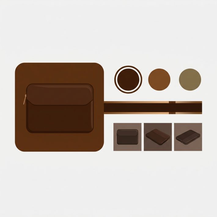
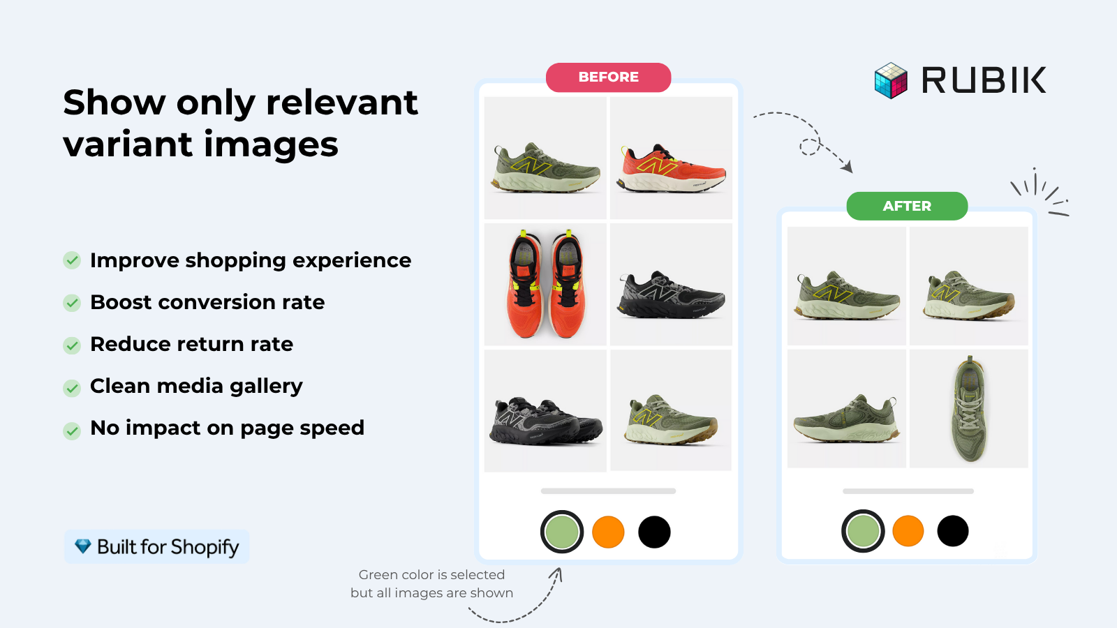
Product card swatches are the small color (or image) chips that sit on a product card across your collection pages, search results, and home page. Click one and the card’s image swaps to that color. They can also update the card’s price and add-to-cart link, so a shopper can pick a color before they ever open the product page.
We shipped this in Rubik Variant Images on May 26, 2026. It’s live for every merchant. Worth being precise about scope: these swatches represent the variants of a single product. One hoodie, eight colors, eight chips on its card. (That’s different from grouping separate products together, which we’ll get to.) Hovering a swatch previews that variant’s image; clicking it swaps the card. On desktop that’s click-to-switch, on mobile it’s tap-to-switch, both on by default.
One detail merchants miss: it’s metafield-based, with no external API calls, and it works natively on 177+ themes including Dawn and Horizon. So adding swatches doesn’t mean bolting a slow third-party script onto every collection page. It loads with the page.
Fewer clicks to the right color
The most direct conversion lever is click reduction. Every extra step between a shopper and the color they want is a chance for them to leave. Product card swatches collapse “open page, find color picker, click, wait, decide” into “click chip, see color, keep shopping.” That shortens the path to add-to-cart.
Think about how people actually browse a collection. They scan. They don’t read. A card showing a single grey photo says one thing: grey. A card with a row of color chips says: grey, navy, olive, rust, and four more. The shopper’s eye catches the color they were hunting for, and now there’s a reason to click. Without the chips, that reason never appears.
Here’s the part most blogs get backwards. They treat swatches as decoration. They’re not. They’re a signal that says “this thing exists in your color.” That signal is what moves a passive scroll into an intentional click. Decoration doesn’t sell. Information does.
Color discovery and bounce
Color discovery is the quieter win, and it directly fights bounce. When a shopper can’t tell a product comes in their color, they assume it doesn’t, and they leave the page. Swatches surface the full range up front, so the catalog looks deeper and more relevant without the shopper digging for it.
Why does this matter for bounce specifically? Because a lot of collection-page exits aren’t “I didn’t like anything.” They’re “I didn’t see what I wanted.” Those are different problems. The second one is fixable. If the right color was always there, hidden behind a default thumbnail, showing it on the card keeps the shopper engaged instead of bouncing to a competitor.
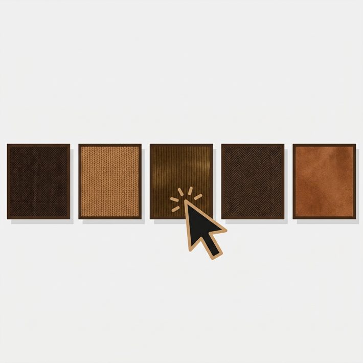
There’s a merchandising angle too. By default our product card swatches show the first variant option only, which keeps cards clean (a wall of 40 chips is its own kind of friction). And we use smaller swatch sizes on cards than on the product page, on purpose, so the photo still leads and the chips support it. Clean discovery beats cluttered discovery every time.
Wrong color returns and support load
Conversion isn’t only the front-end click. It’s also what happens after checkout, and color confusion drives returns. When the image a shopper saw doesn’t match the variant they bought, you get a return, a refund, and sometimes a chargeback. Showing the correct color image early (on the card and again on the product page) lowers that mismatch rate.
This is where the product page side of Rubik Variant Images and the new card swatches reinforce each other. On the card, the shopper picks the color. On the product page, the gallery filters to that exact color instead of dumping all eight color sets in one scroll. So the image they buy from is the image of the thing they’re actually buying. That consistency is what reduces “this isn’t the color I ordered” tickets.
One of our merchants put the support side better than we could. This is a verbatim review from the Shopify App Store:
“We’ve tried several solutions for managing variant images, but Rubik Variant Images stands out. It’s like giving our product pages a much-needed declutter. Customers now see only the images that match their selection, which has noticeably reduced the ‘Is this the right color?’ support queries. The setup was intuitive, and the results were instant. It’s one of those behind-the-scenes tools that quietly makes a big difference. Love it!”
Livspace Home, India, 2025-07-10, Rubik Variant Images on the Shopify App Store
Fewer “is this the right color?” queries is a real, measurable cost saving even if you never touch your conversion rate. Support time is money. Returns are money. Both go down when the right image shows up at the right moment.
When swatches won’t help
Swatches won’t help if your products don’t have meaningful color variety, or if shoppers don’t choose by color. Slapping chips on a card that sells one beige planter in one finish adds noise and zero value. Be honest about your catalog before you turn anything on.
A few cases where we’d tell you to skip it (yes, even though we built the feature):
- Single-color products. No variants, nothing to show.
- Catalogs where size, not color, is the deciding factor. A size row on a card rarely helps.
- Products with so many colors that chips would swamp the photo. (We default to the first option only to avoid this, but use judgment.)
- Stores where each color is already its own separate product. That’s a different tool, which we’ll cover next.
Why am I telling you when not to use our feature? Because a swatch row that helps nobody is worse than no swatch row. It’s clutter, and clutter hurts conversions. Strong opinion, but I’ll stand by it.
Variants on one card vs separate products
This is the single most important decision before you add swatches, and it changes which app you use. If your colors are variants of one product, Rubik Variant Images puts swatches on that product’s card. If each color is its own separate product with its own URL, that’s Rubik Combined Listings, which groups those products and shows swatches across them on collection pages.
Both improve discovery. They just fit different catalog structures. Here’s the split:
| Situation | Use | Why |
|---|---|---|
| One product, many color variants | Rubik Variant Images (product card swatches) | Chips show the variants of that single product on its card |
| Each color is a separate product / URL | Rubik Combined Listings | Groups separate products, shows swatches across them on collection pages |
| Want unique URLs and images per color for SEO | Rubik Combined Listings | Each color ranks on its own page, no 2,048-variant ceiling |
| Want clean per-variant galleries on the product page | Rubik Variant Images | Filters the gallery to the selected color |
| Both structures in one store | Both apps together | RVI handles single-product variants, RCL handles grouped separate products |
Plenty of stores run both. If you’re still deciding which model fits, our team wrote up the trade-offs in combined listings explained on rubikify.com, and there’s a broader CRO take in the best Shopify color swatch app roundup on craftshift.com. Want the collection-page mechanics? See our guide to Shopify collection page color swatches.
How to turn them on without breaking your theme
Turning on product card swatches takes one toggle, and they’re off by default so nothing changes until you opt in. In Rubik Variant Images, open the Swatch settings page and switch on “Enable on product cards.” Styling lives under the “Swatch style” section in the “Product Card” tab, separate from your product page swatch styling.
The setup order we’d recommend:
- Assign your variant images first, by hand or with AI auto-assign for one product at a time, or bulk assign by gallery order across your whole catalog.
- Turn on “Enable on product cards” in Swatch settings.
- Style the card chips in the Product Card tab. Keep them small so the photo still leads.
- Check a collection page on desktop and mobile. Confirm the click-to-switch and tap-to-switch behavior feels right.
- If your theme is custom and chips don’t line up, contact support to map it. Built for Shopify, Shadow DOM styling, no theme conflicts.
If you’re on Dawn, our Dawn theme variant images guide covers the product-page side, and if chips ever stop rendering, the color swatches not working fix walks through the usual culprits. Picking a chip shape? We compared button swatches vs circle swatches too.
See product card swatches running in the live demo store, watch the tutorial video, or read the getting started guide. For separate-product grouping, there’s the Combined Listings demo and its getting started docs.
Frequently asked questions
Do product card swatches actually increase conversions?
They help conversions by cutting clicks to the right color, surfacing colors a shopper would otherwise miss, and lowering wrong-color returns. We won’t quote a fixed percentage because there isn’t honest data for one. The mechanics favor most color-heavy catalogs, but a single-color store won’t see a lift.
Does Rubik Variant Images show swatches on collection pages now?
Yes, as of the May 2026 update. Rubik Variant Images shows product card swatches for the variants of a single product across collection pages, search results, and other listing pages. Older notes that called it product-page-only are outdated. The feature is off by default and you opt in with one toggle.
Will product card swatches slow down my store?
No. The feature is metafield-based with no external API calls, so it loads with the page rather than calling out to a separate server. It works natively on 177+ themes including Dawn and Horizon, and custom themes can be mapped by support.
Can I show only some options instead of every color?
By default cards show the first variant option only, which keeps them clean and avoids a wall of chips. Card swatches also use smaller sizes than product page swatches by design. You control the look in the Product Card tab under Swatch style.
What if each color is a separate product?
Then use Rubik Combined Listings instead. It groups separate products and shows swatches across them on collection pages, with a unique URL and images per color (better for SEO and the 2,048-variant limit). Many stores run both apps, RVI for single-product variants and RCL for grouped products.